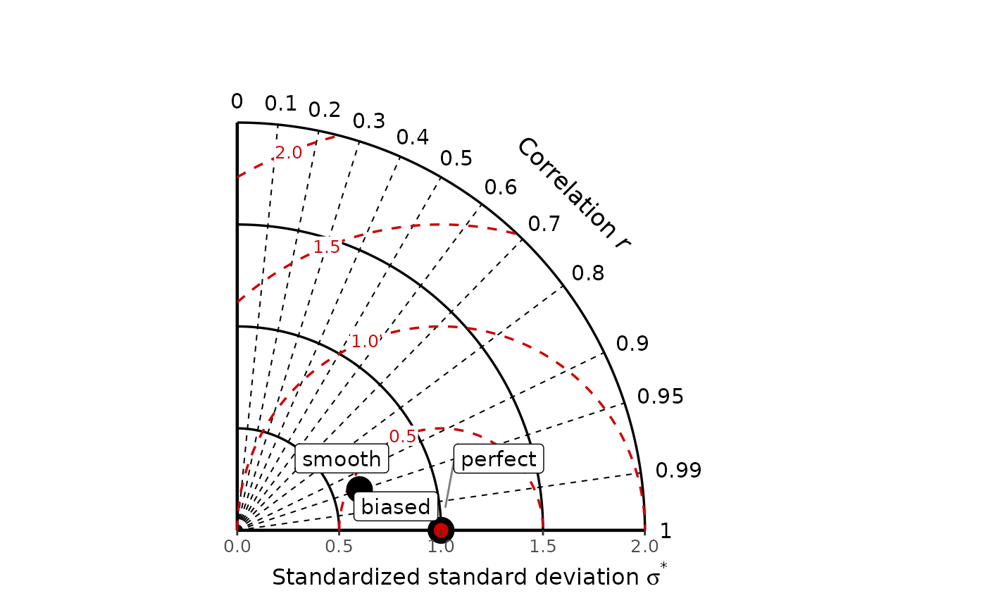
Creates a Taylor diagram comparing one or more quantitative prediction models with an observation vector. The radial coordinate is the model standard deviation divided by the observation standard deviation and the polar angle represents the Pearson correlation. Optional centred root-mean-square distance (RMSD) contours are drawn around the observation reference point.
Usage
gg_taylor(
  mods,
  obs,
  label = FALSE,
  legend = FALSE,
  point_size = 6,
  label_size = 4,
  na.rm = TRUE,
  half = FALSE,
  rmsd = TRUE,
  rmsd_colour = "red3",
  rmsd_breaks = NULL
)
Arguments
- mods
Numeric vector, list of numeric vectors, or numeric matrix/data frame with one model per column. Rows match
obsin order. Supplied model names must be unique; missing names are generated.- obs
A numeric observation vector.
- label
Logical; draw model names directly on the diagram using
ggrepel?- legend
Logical; colour model points by model and display a legend? The standard ggplot2 discrete colour palette is used by default.
- point_size
Numeric size of model points.
- label_size
Numeric text size for model labels.
- na.rm
Logical; remove incomplete observation-prediction pairs separately for each model? If
FALSE, missing pairs cause an error because diagram coordinates cannot be calculated. The default isTRUE.- half
Logical; if
TRUE, draw only the positive-correlation portion of the Taylor diagram (r = 0 to r = 1). IfFALSE, draw the full Taylor diagram (r = -1 to r = 1).- rmsd
Logical; show centred RMSD contours and their labels?
- rmsd_colour
Character string giving the colour of the RMSD contours and labels.
- rmsd_breaks
Optional numeric vector giving the RMSD contour values. If
NULL, contours are drawn every 0.5 units.
Value
A ggplot2 plot object. It can be extended with ordinary ggplot2
layers, scales, labels, and themes.
Details
The geometry and default styling follow Wadoux, Walvoort, and Brus (2022) and the original implementation in the accompanying repository.
Missing pairs are removed separately per model when na.rm = TRUE.
Two complete pairs with non-zero observation SD are required. All plotted
statistics can be retrieved with diagram_stats().
Model names can be displayed either directly on the diagram with
label = TRUE or through a colour legend with legend = TRUE.
With legend = TRUE, model points use the standard ggplot2 discrete colour
palette. Because the returned object is a regular ggplot2 object, the model
colour scale, legend, theme, titles, fonts, and other graphical elements can
subsequently be customised with ordinary ggplot2 layers.
RMSD contours can be removed with rmsd = FALSE, recoloured with
rmsd_colour, or placed at user-defined values with rmsd_breaks.
Interpretation
Let sigma-star denote the prediction standard deviation divided by the
observation standard deviation, and let r be Pearson correlation.
The Taylor geometry follows
$$\mathrm{SDE}^{*} = \sqrt{1 + \sigma_{\mathrm{star}}^2 -
2\sigma_{\mathrm{star}}r},$$
where SDE* is the centred (unbiased) root mean square difference divided by
the observation standard deviation. Radial distance gives sigma_star; the
polar angle is acos(r); and the reference point has a standard-deviation
ratio of one and correlation of one. Points nearer the reference point have
smaller unbiased error.
A point inside the unit-radius arc has less variation than the observations
(a smoother prediction), while a point outside it has greater variation.
Points nearer the horizontal positive-correlation axis have stronger pattern
agreement. The diagram does not show mean error: a model can be close to the
reference point but systematically biased. Use gg_solar() or gg_target()
together with bias() when mean error is important.
References
Wadoux, A. M. J.-C., Walvoort, D. J. J., and Brus, D. J. (2022). An integrated approach for the evaluation of quantitative soil maps through Taylor and solar diagrams. Geoderma, 405, 115332. doi:10.1016/j.geoderma.2021.115332
Taylor, K. E. (2001). Summarizing multiple aspects of model performance in a single diagram. Journal of Geophysical Research, 106, 7183-7192. doi:10.1029/2000JD900719