
Predictive-uncertainty evaluation
Alexandre M.J.-C. Wadoux
Source:vignettes/predictive-uncertainty.Rmd
predictive-uncertainty.Rmd1. Why validate predictive uncertainty?
Point-prediction metrics assess how close predictions are to observations, but many models also quantify how uncertain each prediction is. This information may be supplied as prediction intervals, predicted quantiles, a predictive mean and standard deviation, or a complete predictive distribution.
These probabilistic predictions should be validated just like point predictions. A poorly calibrated uncertainty estimate can give users unwarranted confidence in a prediction even when the point prediction itself appears reasonable.
Two properties are particularly important:
- Calibration, also called reliability, describes whether stated probabilities agree with observed frequencies. For example, approximately 90% of independent observations should fall inside intervals presented as 90% prediction intervals.
- Sharpness describes how concentrated the predictive distributions are. Narrower prediction intervals correspond to sharper predictions.
Sharpness should always be interpreted conditional on adequate calibration. Very narrow intervals are not useful when observations frequently fall outside them. The general objective is therefore to obtain predictive distributions that are as sharp as possible while remaining well calibrated (Schmidinger and Heuvelink 2023; Gneiting and Raftery 2007).
As with point-prediction validation, these diagnostics should be calculated using independent validation data or an appropriate resampling strategy.
2. Which form of predictive uncertainty do you have?
Probabilistic predictions can be supplied in several forms, including prediction intervals, predicted quantiles, predictive means and standard deviations, and full predictive distributions. This tutorial develops two broad worked cases:
- Case A — predictive mean and standard deviation: the predictive distribution is summarized by its mean and standard deviation. Prediction intervals, quantiles, CDF values, and densities can be derived when an appropriate distributional assumption is available.
- Case B — predictive samples: the predictive distribution is represented directly by predictive samples or draws. This can preserve features such as skewness, heavy tails, and multimodality that may not be represented by a mean and standard deviation alone.
Prediction intervals and quantiles may also be supplied directly by a model. The same validation principles apply regardless of how they were generated. A model may also provide several representations of the same predictive distribution.
3. Functions used in this tutorial
The main modelskill functions used below are:
| Function | Description | Reference |
|---|---|---|
picp() |
Calculates the prediction interval coverage probability, that is, the proportion of observations falling within a prediction interval. | (Goovaerts 2001; Schmidinger and Heuvelink 2023) |
coverage_error() |
Calculates the difference between empirical and nominal prediction interval coverage. | (Schmidinger and Heuvelink 2023) |
interval_width() |
Calculates the average width of prediction intervals and therefore summarizes their sharpness. | (Schmidinger and Heuvelink 2023) |
interval_score() |
Calculates a proper scoring rule that combines prediction interval width with penalties for observations outside the interval. | (Gneiting and Raftery 2007) |
uncertainty_metrics() |
Calculates PICP, coverage error, interval width, and interval score together. | (Gneiting and Raftery 2007; Schmidinger and Heuvelink 2023) |
gg_coverage() |
Produces a reliability plot comparing nominal prediction interval coverage with empirical coverage across several interval levels. | (Goovaerts 2001; Schmidinger and Heuvelink 2023) |
accuracy_plot_metrics() |
Summarizes deviations between the empirical coverage curve and the ideal 1:1 reliability line. | (Goovaerts 2001; Schmidinger and Heuvelink 2023) |
qcp() |
Calculates quantile coverage probability, the proportion of observations below each predicted quantile. | (Schmidinger and Heuvelink 2023) |
gg_qcp() |
Produces a quantile calibration plot comparing nominal quantile probabilities with empirical quantile coverage. | (Schmidinger and Heuvelink 2023) |
pit() |
Calculates probability integral transform values from predictive CDF values, predictive means and standard deviations under a normal assumption, or equally weighted predictive samples using their empirical CDF. | (Gneiting et al. 2007; Schmidinger and Heuvelink 2023) |
gg_pit() |
Produces a PIT histogram for assessing the calibration of complete predictive distributions. | (Gneiting and Raftery 2007; Schmidinger and Heuvelink 2023) |
crps() |
Calculates the continuous ranked probability score, a proper score that evaluates the full predictive distribution. | (Hersbach 2000; Gneiting and Raftery 2007) |
median_crps() |
Calculates the median case-wise CRPS, providing a robust summary of typical probabilistic prediction performance. | (Gneiting and Raftery 2007) |
crps_decomposition() |
Decomposes CRPS into reliability and potential CRPS components when predictive samples are available. | (Hersbach 2000; Schmidinger and Heuvelink 2023) |
log_score() |
Calculates the logarithmic score from predictive density values evaluated at the observations. | (Gneiting and Raftery 2007) |
The appropriate functions depend on the available model output. For
example, picp(), coverage_error(),
interval_width(), interval_score(), and
uncertainty_metrics() accept explicit bounds, predictive
mean and standard deviation under a normal assumption, or equally
weighted predictive samples. qcp(), gg_qcp(),
gg_coverage(), and accuracy_plot_metrics() can
also derive their quantiles or intervals directly from either predictive
representation. crps() and median_crps()
support both representations. crps_decomposition() remains
sample-only. pit() accepts predictive CDF values, normal
predictive means and standard deviations, or predictive samples.
log_score() requires predictive density values evaluated at
the observations.
4. Example data
We first create a simple situation in which the predictive distributions are correctly calibrated by construction.
library(modelskill)

set.seed(123)

n <- 500

# Predictive means
pred <- seq(0, 10, length.out = n)

# True predictive standard deviation
predictive_sd <- rep(1, n)

# Independent observations generated from the predictive distributions
obs <- stats::rnorm(
  n,
  mean = pred,
  sd = predictive_sd
)
Here, observation i is generated from
Y_i \sim N(\mathrm{pred}_i, \sigma_i^2),
with \sigma_i = 1. Because the predictive model and data-generating process are the same, the uncertainty estimates should be approximately calibrated. Departures from perfect calibration still occur because validation is based on a finite sample.
5. Case A: predictive mean and standard deviation
A common output from geostatistical models, Bayesian approximations, Gaussian processes, and other statistical models is a predictive mean together with a predictive standard deviation.
If a normal predictive distribution is appropriate, prediction intervals, quantiles, CDF values, and predictive densities can all be obtained from these two quantities.
5.1 Prediction intervals
For a central 95% prediction interval:
lower95 <- pred + stats::qnorm(0.025) * predictive_sd
upper95 <- pred + stats::qnorm(0.975) * predictive_sd
A 95% prediction interval means that, under calibration, approximately 95% of independent observations should fall between the corresponding lower and upper bounds.
5.1.1 Prediction interval coverage probability
The prediction interval coverage probability (PICP) is the empirical proportion of observations contained in the interval:
\mathrm{PICP}(\tau) = \frac{1}{n} \sum_{i=1}^{n} I(l_i \leq y_i \leq u_i).
where \tau is the nominal interval level.
picp(obs, lower95, upper95)
#> [1] 0.946
For a 95% prediction interval, a well-calibrated model should return a value close to 0.95.
modelskill reports PICP on the probability scale from 0
to 1 rather than as a percentage.
5.1.2 Coverage error
coverage_error()
directly compares empirical and nominal coverage:
\mathrm{coverage\ error} = \mathrm{PICP}(\tau) - \tau.
coverage_error(
  obs,
  lower95,
  upper95,
  level = 0.95
)
#> [1] -0.004
Interpretation is straightforward:
- 0: empirical and nominal coverage agree;
- negative: under-coverage, meaning that observations fall outside the intervals too frequently;
- positive: over-coverage, meaning that observations fall inside the intervals more frequently than required.
Under-coverage often indicates that predictive uncertainty has been underestimated, whereas substantial over-coverage can indicate unnecessarily wide uncertainty estimates.
5.1.3 Prediction interval width
Calibration alone is not sufficient. A model could achieve high coverage simply by producing extremely wide intervals.
interval_width()
measures average prediction interval width:
\mathrm{PIW}(\tau) = \frac{1}{n} \sum_{i=1}^{n} (u_i-l_i).
interval_width(
  obs,
  lower95,
  upper95
)
#> [1] 3.919928
PIW has the same units as the response variable. Smaller values mean sharper prediction intervals.
Importantly, PIW does not measure calibration and does not depend on where the observations fall. It should therefore always be interpreted together with a coverage diagnostic such as PICP.
5.1.4 Interval score
The interval_score()
combines sharpness and calibration in a single proper score.
interval_score(
  obs,
  lower95,
  upper95,
  level = 0.95
)
#> [1] 4.515157
The score contains the interval width plus penalties when an observation falls below or above the interval. The farther an observation lies outside the interval, the larger the penalty.
Lower interval scores are better. Scores should only be compared for the same validation data, response scale, and interval level.
5.1.5 Calculate all interval diagnostics together
uncertainty_metrics()
is a convenience wrapper that returns the principal interval diagnostics
together:
uncertainty_metrics(
  obs,
  lower = lower95,
  upper = upper95,
  level = 0.95
)
#>    picp picp_error interval_width interval_score
#> 1 0.946     -0.004       3.919928       4.515157

# Equivalent direct interface under the normal assumption:
uncertainty_metrics(obs, pred = pred, predictive_sd = predictive_sd, level = 0.95)
#>    picp picp_error interval_width interval_score
#> 1 0.946     -0.004       3.919928       4.515157
It returns:
-
picp: empirical prediction interval coverage; -
picp_error: empirical minus nominal coverage; -
interval_width: average interval width; -
interval_score: proper interval score.
The individual functions remain useful when only one diagnostic is required.
5.2 Why calibration and sharpness must be considered together
Consider a second uncertainty estimate that uses the same predictive means but standard deviations that are only half as large:
sd_too_small <- rep(0.5, n)

lower95_narrow <- pred + stats::qnorm(0.025) * sd_too_small
upper95_narrow <- pred + stats::qnorm(0.975) * sd_too_small

uncertainty_metrics(
  obs,
  lower = lower95_narrow,
  upper = upper95_narrow,
  level = 0.95
)
#>    picp picp_error interval_width interval_score
#> 1 0.678     -0.272       1.959964       8.526239
These intervals are much narrower and therefore appear sharper. However, their coverage should be substantially below 0.95 because the predictive uncertainty has been underestimated.
Compare this with the calibrated intervals:
uncertainty_metrics(
  obs,
  lower = lower95,
  upper = upper95,
  level = 0.95
)
#>    picp picp_error interval_width interval_score
#> 1 0.946     -0.004       3.919928       4.515157
This illustrates why a smaller interval width is desirable only when calibration remains adequate.
5.3 Reliability across multiple interval levels
A single PICP assesses one interval level only. It is often more informative to evaluate calibration across many central prediction intervals.
gg_coverage()
constructs this reliability curve directly from predictive means and
standard deviations:
gg_coverage(
  obs,
  pred = pred,
  predictive_sd = predictive_sd
)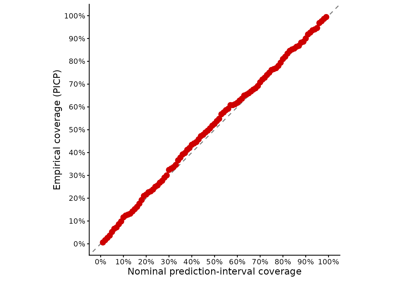
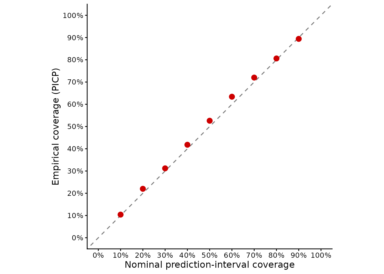
Nominal interval coverage is shown on the horizontal axis and empirical PICP on the vertical axis.
A well-calibrated model should follow the 1:1 line.
- Points below the line indicate under-coverage and generally underestimated uncertainty.
- Points above the line indicate over-coverage and generally overly conservative uncertainty.
The same plot for the deliberately underestimated predictive standard deviations shows the difference:
gg_coverage(
  obs,
  pred = pred,
  predictive_sd = sd_too_small
)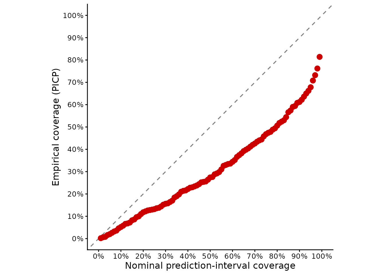
In geostatistical uncertainty validation this display has traditionally also been called an accuracy plot (Goovaerts 2001), although reliability plot is the more general terminology used for probabilistic predictions.
5.3.1 Numerical summaries of the reliability plot
The reliability or accuracy plot can be interpreted visually, but departures from the ideal 1:1 line can also be summarized numerically. Accuracy plots were introduced for the assessment of local uncertainty by Deutsch (1997) and were subsequently used for geostatistical uncertainty evaluation in soil science by Goovaerts (2001). The same framework, including numerical summaries of departure from the 1:1 line, was used by Wadoux et al. (2018).
For a nominal central prediction-interval level p, let \mathrm{PICP}(p) denote the empirical proportion of validation observations contained in the corresponding prediction intervals. If predictive uncertainty is well calibrated,
\mathrm{PICP}(p) \approx p
over the range of evaluated probabilities. The empirical coverage curve should therefore follow the 1:1 line.
accuracy_plot_metrics()
summarizes the magnitude and direction of departures from this line:
accuracy_plot_metrics(
  obs,
  pred = pred,
  predictive_sd = predictive_sd
)
#>   absolute_deviation over_uncertainty under_uncertainty over_percent
#> 1         0.01376333       0.01354167      0.0002216667     98.38944
#>   under_percent
#> 1      1.610559
For the deliberately underestimated predictive uncertainty:
accuracy_plot_metrics(
  obs,
  pred = pred,
  predictive_sd = sd_too_small
)
#>   absolute_deviation over_uncertainty under_uncertainty over_percent
#> 1            0.18968                0           0.18968            0
#>   under_percent
#> 1           100
The principal summary is absolute_deviation, which
corresponds to the total area between the empirical coverage curve and
the ideal 1:1 line:
A = \int_0^1 \left| \mathrm{PICP}(p)-p \right| \,dp.
A value of A=0 indicates perfect calibration. Increasing values indicate greater overall disagreement between nominal and empirical coverage across the evaluated interval levels. This measure summarizes the magnitude of miscalibration but does not, by itself, indicate whether predictive uncertainty is predominantly overestimated or underestimated.
The calculation integrates the piecewise-linear coverage curve
exactly, splitting segments where they cross the 1:1 line. The endpoints
(0, 0) and (1, 1) are assumed rather than
measured, so the area depends on the supplied levels and interpolation.
With interval lists, gg_coverage() and
accuracy_plot_metrics() use only cases complete across all
supplied levels.
The total deviation can therefore be separated into the area above the 1:1 line,
A_{\mathrm{over}} = \int_0^1 \max\left\{ \mathrm{PICP}(p)-p,0 \right\} \,dp,
and the area below the line,
A_{\mathrm{under}} = \int_0^1 \max\left\{ p-\mathrm{PICP}(p),0 \right\} \,dp.
These quantities are returned as:
-
absolute_deviation: the total area A between the empirical coverage curve and the 1:1 line. Smaller values indicate better overall calibration, with zero being ideal; -
over_uncertainty: the area A_{\mathrm{over}} above the 1:1 line. In this region empirical coverage is greater than nominal coverage, indicating over-coverage and, in general, predictive uncertainty that is too large; -
under_uncertainty: the area A_{\mathrm{under}} below the 1:1 line. In this region empirical coverage is smaller than nominal coverage, indicating under-coverage and, in general, predictive uncertainty that is too small; -
over_percent: the percentage of the total absolute deviation occurring above the 1:1 line; -
under_percent: the percentage of the total absolute deviation occurring below the 1:1 line.
The last two quantities correspond to the relative contributions of overestimation and underestimation to the total calibration error:
P_{\mathrm{over}} = \frac{A_{\mathrm{over}}}{A}, \qquad P_{\mathrm{under}} = \frac{A_{\mathrm{under}}}{A}.
accuracy_plot_metrics() reports these quantities as
percentages. When absolute_deviation is greater than
zero,
\mathrm{over\_percent} + \mathrm{under\_percent} = 100.
These percentages should not be interpreted as percentages of observations. They describe how the total area of miscalibration is partitioned above and below the 1:1 line.
For example, a large under_percent indicates that most
of the departure from ideal calibration results from empirical coverage
being lower than nominal coverage. The prediction intervals are
therefore generally too narrow, and predictive uncertainty is
underestimated. Conversely, a large over_percent indicates
that most of the departure results from empirical coverage exceeding
nominal coverage, which is generally associated with prediction
intervals that are too wide and predictive uncertainty that is
overestimated.
These summaries quantify calibration, not sharpness. A predictive model may achieve good coverage while producing unnecessarily wide prediction intervals. Calibration summaries should therefore be interpreted together with measures of interval width or proper scoring rules when comparing probabilistic predictions.
The area summaries are most informative when the reliability curve is evaluated over a sufficiently dense range of nominal interval levels. With only one or a few interval levels, a single coverage error is usually easier to interpret than an integrated area.
The interpretation above follows the accuracy-plot framework of (Deutsch 1997; Goovaerts 2001), with the absolute-deviation and directional summaries described and applied in Wadoux et al. (2018).
5.4 Why PICP alone is not enough
PICP measures whether observations fall inside an interval, but it does not describe where the observations that fall outside the interval occur.
This means that PICP can hide a one-sided bias.
For example, for a central 90% prediction interval we expect approximately 5% of observations below the lower boundary and 5% above the upper boundary. A model could instead have approximately 10% below the lower boundary and almost none above the upper boundary while still obtaining approximately 90% total coverage.
Schmidinger and Heuvelink (2023) showed that this limitation can occur in practice and recommended complementing PICP with quantile-based calibration or PIT diagnostics.
We can reproduce the idea with a deliberately shifted predictive distribution.
The predictive mean is shifted upward by 0.5 response units. Its predictive standard deviation is also increased so that central 90% coverage can remain close to its nominal value.
biased_pred <- pred + 0.5
biased_sd <- rep(1.118, n)

lower90_biased <-
  biased_pred + stats::qnorm(0.05) * biased_sd

upper90_biased <-
  biased_pred + stats::qnorm(0.95) * biased_sd

uncertainty_metrics(
  obs,
  lower = lower90_biased,
  upper = upper90_biased,
  level = 0.90
)
#>    picp picp_error interval_width interval_score
#> 1 0.918      0.018       3.677893       4.371123
The total PICP may look acceptable even though the predictive distribution is systematically displaced. Individual quantiles reveal this problem more clearly.
5.5 Quantile coverage probability
Prediction interval coverage probability evaluates whether observations fall inside prediction intervals, but it does not distinguish between the lower and upper tails. Quantile coverage probability (QCP) provides a complementary calibration diagnostic by evaluating individual predictive quantiles.
For a correctly calibrated predictive quantile at probability p, approximately a fraction p of observations should fall below that predicted quantile. The quantile coverage probability (QCP) is
\mathrm{QCP}(p) = \frac{1}{n} \sum_{i=1}^{n} I(y_i \leq q_{i,p}),
where q_{i,p} is the predicted p-quantile for observation i.
For a calibrated predictive distribution,
- a predicted 0.05 quantile should have QCP close to 0.05;
- a predicted 0.50 quantile should have QCP close to 0.50;
- a predicted 0.95 quantile should have QCP close to 0.95.
It is generally more informative to evaluate QCP across several quantile levels rather than at only a few selected probabilities. We therefore evaluate quantiles from 0.05 to 0.95 at increments of 0.05.
q_levels <- seq(0.05, 0.95, by = 0.05)

qhat <- vapply(
  q_levels,
  function(p) {
    pred + stats::qnorm(p) * predictive_sd
  },
  numeric(n)
)

qcp(
  obs,
  quantiles = qhat,
  levels = q_levels
)
#>  0.05   0.1  0.15   0.2  0.25   0.3  0.35   0.4  0.45   0.5  0.55   0.6  0.65
#> 0.042 0.086 0.138 0.178 0.220 0.272 0.334 0.392 0.440 0.490 0.556 0.608 0.658
#>   0.7  0.75   0.8  0.85   0.9  0.95
#> 0.706 0.746 0.796 0.846 0.896 0.942
For a well-calibrated predictive distribution, the empirical QCP values should be close to their corresponding nominal quantile probabilities.
gg_qcp() displays
this relationship graphically:
gg_qcp(
  obs,
  quantiles = qhat,
  levels = q_levels
)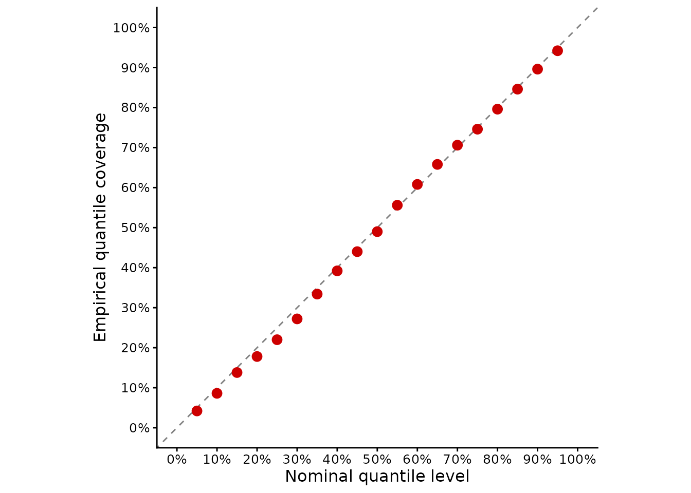
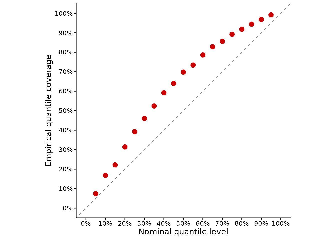
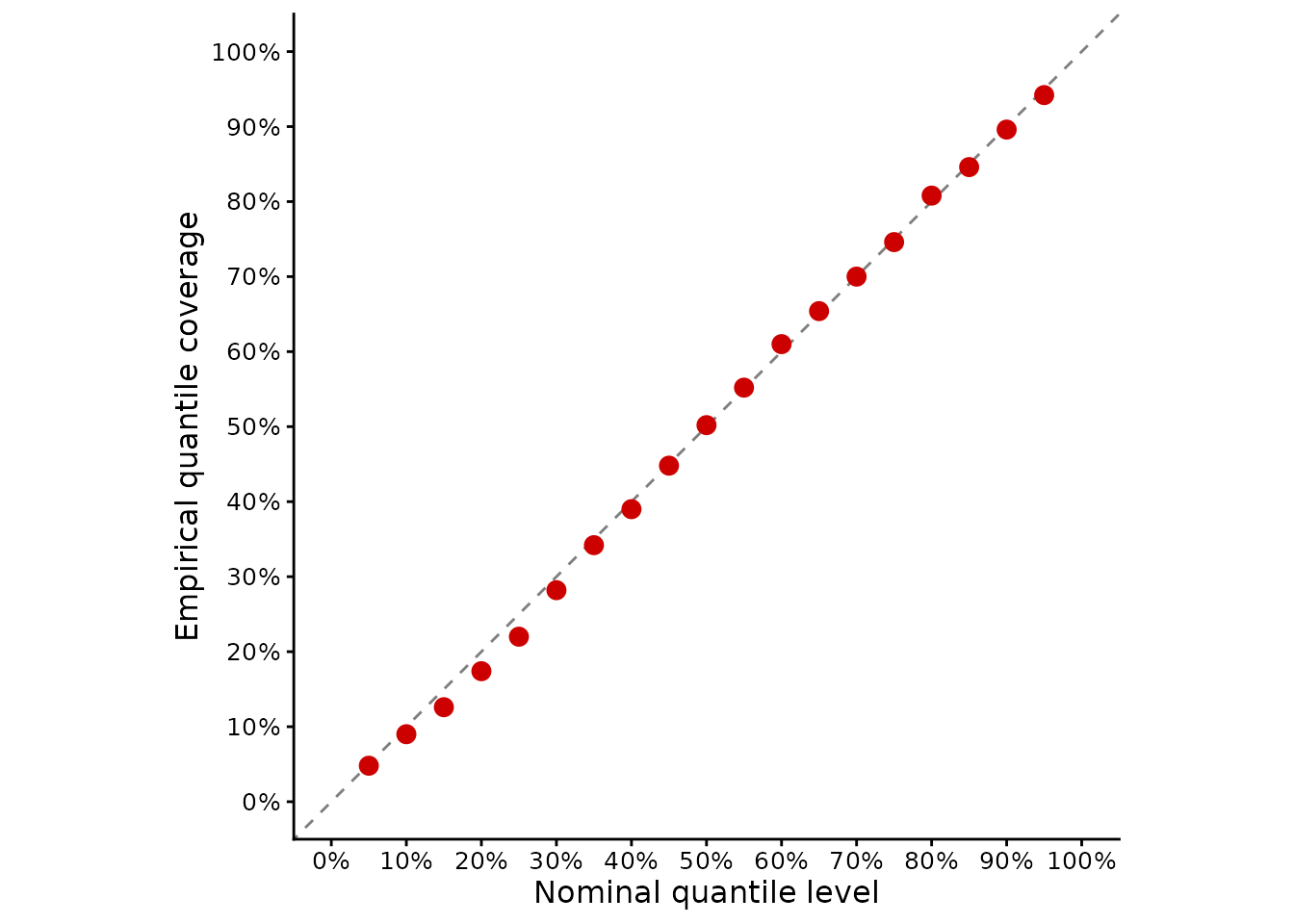
The horizontal axis gives the nominal predictive quantile probability and the vertical axis gives its empirical QCP. Points close to the 1:1 line indicate well-calibrated predictive quantiles.
When the predictive distribution is represented by a predictive mean
and standard deviation and a normal distribution is appropriate,
qcp() and gg_qcp() can also generate these
quantiles directly:
gg_qcp(
  obs,
  pred = pred,
  predictive_sd = predictive_sd
)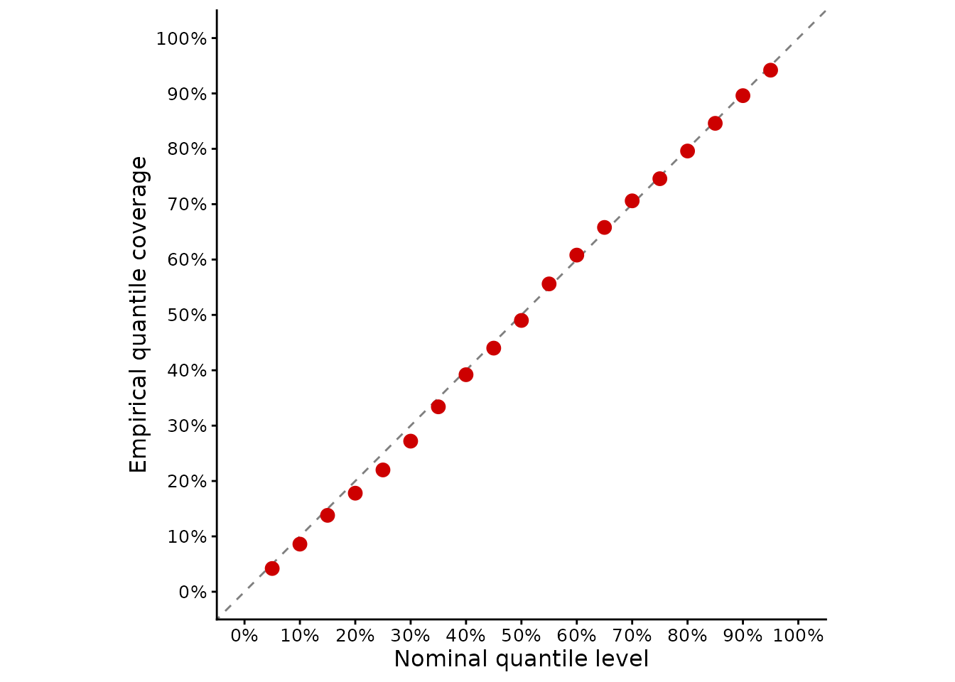
This differs from gg_coverage(). The
reliability or accuracy plot produced by gg_coverage()
evaluates the joint coverage of central prediction
intervals, whereas gg_qcp() evaluates
individual predictive quantiles. For example, a central
90% prediction interval jointly evaluates its 0.05 and 0.95 quantile
bounds. QCP instead evaluates those two quantiles separately.
This distinction is important because satisfactory central interval coverage does not necessarily imply that both tails are calibrated. A prediction interval may contain approximately the expected proportion of observations even when too many observations fall below its lower bound and too few fall above its upper bound.
Now examine the deliberately biased predictive distribution:
qhat_biased <- vapply(
  q_levels,
  function(p) {
    biased_pred + stats::qnorm(p) * biased_sd
  },
  numeric(n)
)

qcp(
  obs,
  quantiles = qhat_biased,
  levels = q_levels
)
#>  0.05   0.1  0.15   0.2  0.25   0.3  0.35   0.4  0.45   0.5  0.55   0.6  0.65
#> 0.074 0.168 0.222 0.314 0.392 0.460 0.524 0.592 0.640 0.698 0.734 0.786 0.828
#>   0.7  0.75   0.8  0.85   0.9  0.95
#> 0.856 0.892 0.918 0.944 0.968 0.992

gg_qcp(
  obs,
  quantiles = qhat_biased,
  levels = q_levels
)
The same plot can be generated directly from its predictive mean and standard deviation:
gg_qcp(
  obs,
  pred = biased_pred,
  predictive_sd = biased_sd
)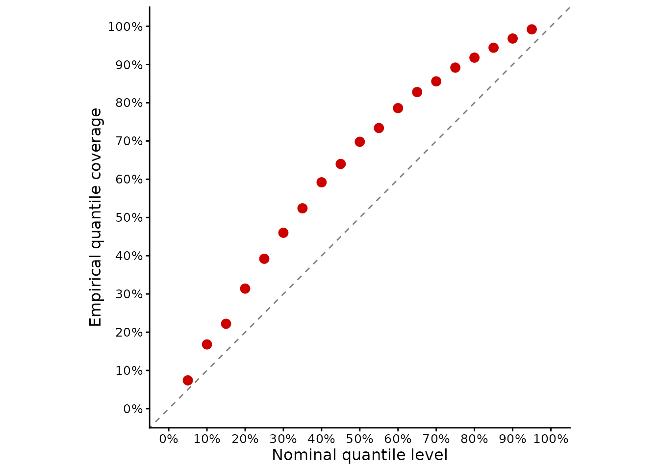
Departures from the 1:1 line indicate quantile miscalibration. QCP above its nominal probability means that observations fall below the predicted quantile more frequently than expected, so the predicted quantile tends to be too high. QCP below its nominal probability means that observations fall below the predicted quantile less frequently than expected, so the predicted quantile tends to be too low.
QCP is therefore particularly useful for identifying asymmetric or one-sided miscalibration that may remain hidden when central prediction-interval coverage is considered alone.
5.6 Probability integral transform
The probability integral transform (PIT) evaluates calibration of the complete predictive distribution. For observation y_i and its predictive cumulative distribution function F_i, the PIT value is
u_i = F_i(y_i).
For calibrated continuous predictive distributions, PIT values evaluated across independent validation observations should be approximately uniformly distributed between 0 and 1 (Gneiting et al. 2007; Schmidinger and Heuvelink 2023).
There is therefore no single ideal PIT value for an individual observation. Calibration is assessed from the distribution of PIT values over the validation set.
When the predictive distribution is represented by a predictive mean
and standard deviation and a normal distribution is appropriate, pit() can calculate the
PIT values directly:
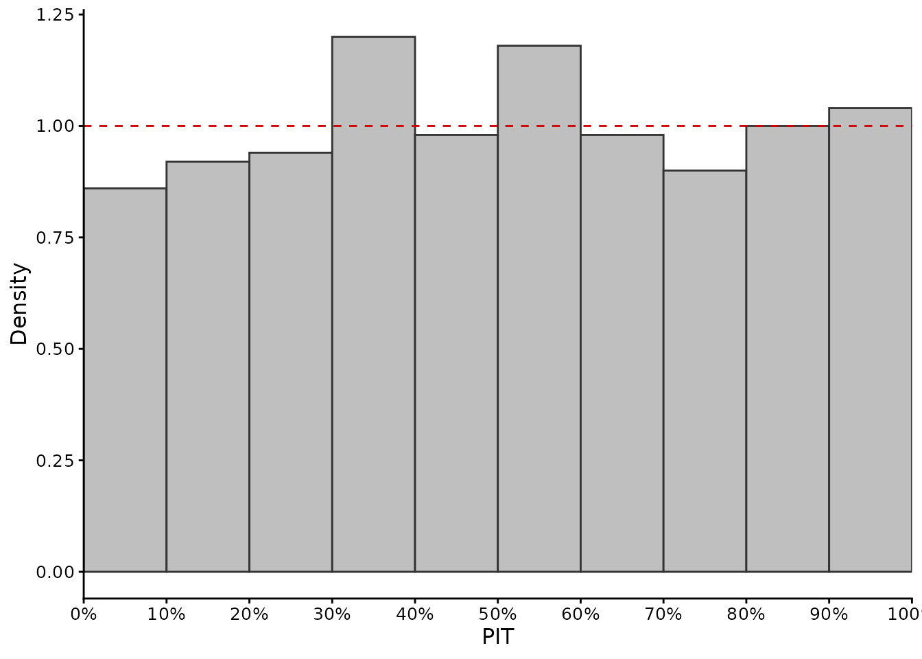
gg_pit() displays
the resulting PIT values as a histogram. The histogram is shown on a
density scale, and the dashed horizontal line at density 1 represents
the expected density under a uniform distribution.
For a well-calibrated predictive distribution, the histogram should therefore be approximately flat around this reference line. Departures from uniformity can provide information about the form of miscalibration:
- a U-shaped histogram, with excess PIT values near 0 and 1, is commonly associated with predictive distributions that are too narrow (underdispersed);
- a hump-shaped histogram, with excess PIT values near 0.5, is commonly associated with predictive distributions that are too wide (overdispersed);
- an excess of PIT values near 0 can occur when predictions are systematically too high relative to the observations;
- an excess of PIT values near 1 can occur when predictions are systematically too low relative to the observations.
These patterns are diagnostic rather than unique: different forms of misspecification can produce similar PIT histograms. Sampling variability can also create apparent departures from uniformity, particularly for small validation datasets.
For example, consider the predictive standard deviations that were deliberately made too small:
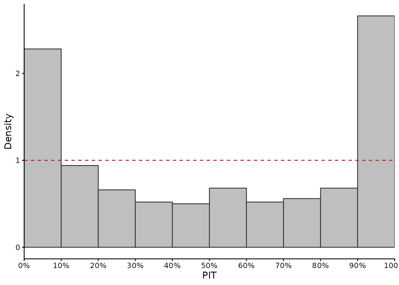
Because these predictive distributions are too narrow, the observations occur in their tails more frequently than expected, producing relatively more PIT values near 0 and 1.
The deliberately biased predictive distribution can be assessed in the same way:
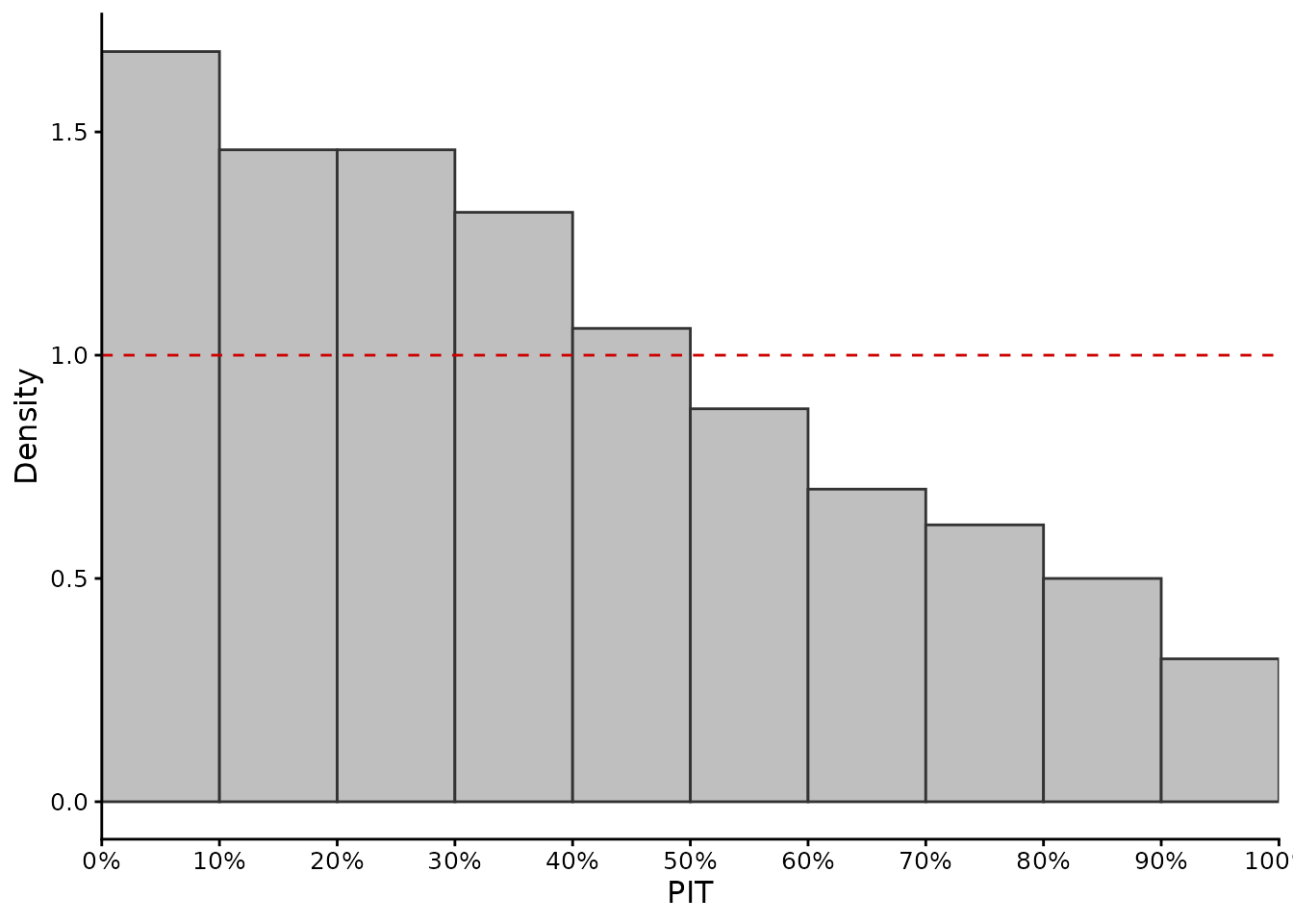
A directional bias tends to shift PIT values towards one side of the unit interval rather than producing a symmetric departure from uniformity.
pit() can also be used when the predictive CDF has been
calculated externally. This allows PIT values to be obtained for
continuous predictive distributions other than the normal
distribution:
cdf_at_obs <- stats::pnorm(
  obs,
  mean = pred,
  sd = predictive_sd
)

pit_from_cdf <- pit(
  cdf_at_obs = cdf_at_obs
)

gg_pit(pit_from_cdf)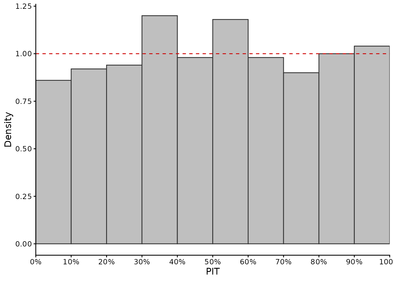
PIT and QCP are closely related because both evaluate calibration across the predictive distribution, but they summarize it differently. QCP evaluates empirical coverage at specified predictive quantiles, whereas PIT evaluates the position of each observation within its complete predictive distribution. Together with prediction-interval coverage, these diagnostics can reveal distributional or asymmetric calibration problems that may not be apparent from central prediction intervals alone (Schmidinger and Heuvelink 2023).
The usual uniformity interpretation of PIT applies to continuous predictive distributions. For discrete distributions or finite predictive ensembles, ordinary PIT values are themselves discrete and randomized PIT or rank-based diagnostics are more appropriate.
5.7 Proper scoring rules
Calibration diagnostics such as PICP, QCP, and PIT ask whether a predictive distribution is statistically reliable.
When several probabilistic models must be compared, it is also useful to have a single numerical criterion that evaluates the predictive distribution as a whole, accounting for both calibration and sharpness. Proper scoring rules are designed for this purpose.
A proper scoring rule encourages honest probabilistic predictions: its expected value is optimized when the reported predictive distribution is the true predictive distribution (Gneiting and Raftery 2007).
5.7.1 Continuous ranked probability score
The continuous ranked probability score (CRPS) compares the complete predictive CDF with the realised observation.
For a normal predictive distribution, crps() can be supplied
with the predictive mean and standard deviation:
crps(
  obs,
  pred = pred,
  predictive_sd = predictive_sd
)
#> [1] 0.5485219
CRPS has the same units as the response variable. Zero is ideal and lower values are better.
Compare the calibrated and underestimated uncertainty models:
crps(
  obs,
  pred = pred,
  predictive_sd = predictive_sd
)
#> [1] 0.5485219

crps(
  obs,
  pred = pred,
  predictive_sd = sd_too_small
)
#> [1] 0.5883077
CRPS penalizes predictive distributions that are poorly centred on the observation or unnecessarily dispersed.
5.7.2 Median CRPS
Mean CRPS can be influenced by a small number of very poor predictive distributions.
median_crps()
summarizes the typical case more robustly:
median_crps(
  obs,
  pred = pred,
  predictive_sd = predictive_sd
)
#> [1] 0.3888205
Mean and median CRPS answer slightly different questions. Mean CRPS is usually preferred for overall probabilistic model comparison, whereas median CRPS can help determine whether the mean score is dominated by a few extreme cases. Median aggregation is a descriptive summary, not itself a proper scoring rule.
5.7.3 Logarithmic score
The log_score() is
another proper score. It uses the predictive density assigned to the
observed value. The mean logarithmic score is
\mathrm{Log\ score} = -\frac{1}{n} \sum_{i=1}^{n} \log f_i(y_i).
For the normal predictive distributions:
density_at_obs <- stats::dnorm(
  obs,
  mean = pred,
  sd = predictive_sd
)

log_score(
  obs,
  density_at_obs
)
#> [1] 1.391731
Lower values are better.
The logarithmic score strongly penalizes observations that were assigned very low predictive density. It can therefore be particularly sensitive to failures in the tails of the predictive distribution.
6. Case B: predictive distributions represented by samples
Some probabilistic models represent the predictive distribution for each validation case by a set of sampled possible values, rather than by parameters such as a predictive mean and standard deviation.
For each observation, these samples provide an empirical representation of the predictive distribution and can be used directly to evaluate predictive uncertainty.
Typical examples are:
- posterior predictive draws from Bayesian models;
- simulation-based models;
- ensemble predictions;
- bootstrap predictive distributions;
- some machine-learning methods like quantile regression forests;
- Monte Carlo uncertainty propagation.
modelskill represents this type of prediction as a
matrix with:
- one row per validation observation;
- one column per predictive draw.
We generate 200 predictive draws for each observation:
set.seed(456)

n_draws <- 200

predictive_samples <- sapply(
  seq_len(n_draws),
  function(j) {
    stats::rnorm(
      n,
      mean = pred,
      sd = predictive_sd
    )
  }
)

dim(predictive_samples)
#> [1] 500 200
Each row of predictive_samples now represents an
empirical approximation to the predictive distribution for one
observation.
6.1 Prediction intervals from predictive samples
Prediction intervals are generated internally from empirical
equal-tailed quantiles using stats::quantile(type = 7).
For a 95% central interval:
uncertainty_metrics(
  obs,
  distribution = predictive_samples,
  level = 0.95
)
#>    picp picp_error interval_width interval_score
#> 1 0.952      0.002        3.84694       4.614292

# Individual interval statistics accept the same input.
picp(obs, distribution = predictive_samples, level = 0.95)
#> [1] 0.952
interval_width(obs, distribution = predictive_samples, level = 0.95)
#> [1] 3.84694
interval_score(obs, distribution = predictive_samples, level = 0.95)
#> [1] 4.614292
A missing observation or any missing predictive draw removes that
entire row when na.rm = TRUE; individual missing draws are
not silently dropped. Standalone interval_width() remains
independent of missing observations.
The interpretation of PICP, interval width, coverage error, and interval score is exactly the same as when the intervals were derived from a predictive mean and standard deviation.
The validation tools depend on the resulting predictive uncertainty, not on the algorithm used to generate it.
6.2 Reliability across interval levels from predictive samples
Pass the predictive samples directly and choose the nominal interval levels. There is no need to construct lower and upper interval lists:
interval_levels <- seq(0.10, 0.90, by = 0.10)

gg_coverage(
  obs,
  distribution = predictive_samples,
  levels = interval_levels
)
and to accuracy_plot_metrics():
accuracy_plot_metrics(
  obs,
  distribution = predictive_samples,
  levels = interval_levels
)
#>   absolute_deviation over_uncertainty under_uncertainty over_percent
#> 1             0.0143          0.01385           0.00045     96.85315
#>   under_percent
#> 1      3.146853
If levels is omitted, both functions evaluate levels
from 1% to 99%. The existing explicit interval-list interface remains
available when a model only provides selected intervals.
6.3 Quantile calibration from predictive samples
Empirical quantiles are extracted internally from each row of predictive samples.
qcp(
  obs,
  distribution = predictive_samples,
  levels = q_levels
)
#>  0.05   0.1  0.15   0.2  0.25   0.3  0.35   0.4  0.45   0.5  0.55   0.6  0.65
#> 0.048 0.090 0.126 0.174 0.220 0.282 0.342 0.390 0.448 0.502 0.552 0.610 0.654
#>   0.7  0.75   0.8  0.85   0.9  0.95
#> 0.700 0.746 0.808 0.846 0.896 0.942
Plot the calibration:
gg_qcp(
  obs,
  distribution = predictive_samples,
  levels = q_levels
)
This approach does not require any parametric assumption about the shape of the predictive distribution.
6.4 PIT from predictive samples
For an analytic distribution, PIT is calculated by evaluating the predictive CDF at the observation.
With predictive samples, the predictive CDF can instead be approximated by the fraction of predictive draws less than or equal to the observation:
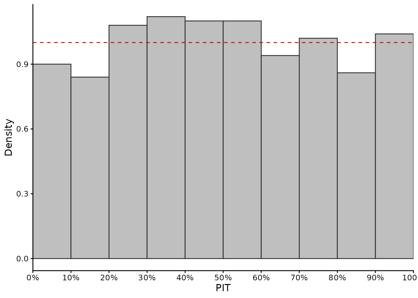
For calibrated continuous predictive distributions, PIT values are uniform. Here the CDF is estimated from a finite ensemble: empirical PIT values lie on a discrete grid and are not exactly continuous-uniform, even for calibrated draws. Interpret the histogram with this finite-ensemble limitation in mind.
The difference is only how F_i(y_i) was obtained:
- with an analytic distribution, evaluate its CDF directly;
- with predictive samples, approximate the CDF empirically.
6.5 CRPS from predictive samples
crps() accepts the predictive sample matrix
directly:
crps(
  obs,
  distribution = predictive_samples
)
#> [1] 0.5485368
No normality assumption is required.
This is useful when predictive distributions are asymmetric, multimodal, or otherwise poorly summarized by a mean and standard deviation.
The median case-wise CRPS is similarly available:
median_crps(
  obs,
  distribution = predictive_samples
)
#> [1] 0.3904392
6.6 CRPS reliability decomposition
When equally weighted predictive samples are available, crps_decomposition()
decomposes CRPS into a reliability component and potential CRPS:
crps_decomposition(
  obs,
  distribution = predictive_samples
)
#>        crps reliability potential_crps
#> 1 0.5485368 0.001597603      0.5469392
The output contains:
-
crps: the total CRPS; -
reliability: the RELI component; -
potential_crps: the remaining component after removing reliability error.
The reliability component is non-negative and has an ideal value of zero. It provides a numerical summary of distributional calibration.
Schmidinger and Heuvelink (2023) showed that RELI summarizes patterns also visible in PICP, QCP, and PIT diagnostics, whereas the total CRPS additionally reflects sharpness and predictive performance.
crps_decomposition() in modelskill is
intended for equally weighted predictive samples. It is therefore not
called directly with a predictive mean and standard deviation.
6.7 What about the logarithmic score with predictive samples?
log_score() requires the predictive density evaluated at
each observation.
If a model provides an analytic density, calculate these density values and supply them directly.
For example, in the normal case:
density_at_obs <- stats::dnorm(
  obs,
  mean = pred,
  sd = predictive_sd
)

log_score(obs, density_at_obs)
#> [1] 1.391731
Predictive samples alone do not uniquely define a smooth probability
density. A density-estimation method would first be required.
modelskill therefore does not automatically estimate a
density from predictive samples before calculating the logarithmic
score.
7. Comparing the two input formats
The two examples above represent the same conceptual predictive uncertainty in different ways.
| Task | Mean + SD | Predictive samples |
|---|---|---|
picp(), coverage_error(),
interval_width(), interval_score()
|
Directly (pred, predictive_sd,
level) |
Directly (distribution, level) |
uncertainty_metrics() |
Directly (pred, predictive_sd,
level) |
Directly (distribution, level) |
gg_coverage() /
accuracy_plot_metrics()
|
Directly (pred, predictive_sd,
levels) |
Directly (distribution, levels) |
qcp() / gg_qcp()
|
Directly (pred, predictive_sd,
levels) |
Directly (distribution, levels) |
pit() |
Directly (pred, predictive_sd) |
Directly (distribution), using the empirical CDF |
gg_pit() |
Supply the values returned by pit()
|
Supply the values returned by pit()
|
crps() / median_crps()
|
Directly (pred, predictive_sd) |
Directly (distribution) |
crps_decomposition() |
No: requires ensemble members | Directly (distribution) |
log_score() |
Supply density_at_obs, e.g. from
dnorm()
|
No automatic density estimation; supply density_at_obs
from an explicitly chosen density model |
The appropriate representation depends on what the prediction model provides. There is generally no reason to reduce a rich predictive distribution to a mean and standard deviation solely for validation if predictive samples or quantiles are already available.
8. A practical workflow
There is no single statistic that completely evaluates predictive uncertainty. Different diagnostics answer different questions.
8.1 If you only have prediction intervals
Start with:
uncertainty_metrics(...)and interpret PICP and interval width together. If intervals are available at several nominal levels, also use:
gg_coverage(...)
accuracy_plot_metrics(...)
8.2 If you have predicted quantiles
Use:
QCP is particularly useful because it can expose directional quantile bias that may be hidden by central interval coverage.
8.3 If you have a predictive mean and standard deviation
When a normal predictive distribution is scientifically appropriate, you can evaluate nearly the complete distribution using:
gg_coverage(...)
pit(...)
gg_pit(...)
crps(...)
median_crps(...)
log_score(...)Prediction intervals and quantiles can also be generated from the normal distribution as shown above.
8.4 If you have predictive samples
Retain them rather than reducing them unnecessarily to a mean and standard deviation.
Pass them directly to the calculation functions:
# Intervals
uncertainty_metrics(...)
# Quantiles
qcp(...)
gg_qcp(...)
# Empirical CDF values
pit(...)
gg_pit(...)
# Proper scores
crps(...)
median_crps(...)
crps_decomposition(...)This preserves asymmetry and other features of the predictive distribution.
9. Recommended interpretation
A practical uncertainty-validation analysis should generally combine several complementary diagnostics.
- Check calibration. Use PICP, QCP, PIT, or preferably more than one of these diagnostics.
- Check sharpness. Examine prediction interval width, but only after verifying calibration.
- Inspect the whole distribution when possible. QCP and PIT can reveal problems that a single central PICP cannot.
- Use proper scores when comparing models. CRPS and interval score combine calibration and sharpness into numerical criteria suitable for relative model comparison.
- Do not select a model from one diagnostic alone. Different metrics emphasize different aspects of probabilistic prediction quality and can therefore lead to different model rankings.
Schmidinger and Heuvelink (2023) demonstrated this explicitly for probabilistic digital soil mapping: PICP could hide one-sided bias, whereas QCP and PIT revealed it, and scoring rules provided additional information when comparing competing probabilistic models.