
Summary diagrams and diagnostic plots
Alexandre M.J.-C. Wadoux
Source:vignettes/summary-diagrams.Rmd
summary-diagrams.Rmd1. Why use summary diagrams?
The performance of a quantitative prediction cannot usually be described adequately by a single statistic. Bias, overall prediction error, correlation, and the ability to reproduce the variability of the observations describe different aspects of predictive performance.
Summary diagrams combine several related statistics into a single graphical representation. This can make differences among models easier to understand than comparing a long table of individual metrics.
modelskill provides three complementary summary
diagrams:
| Diagram | Main information shown | Main function |
|---|---|---|
| Solar diagram | Mean error, centred error, total RMSE, model efficiency, and lower bounds on correlation | gg_solar() |
| Target diagram | Mean error, centred error, total RMSE, and whether prediction variability is smaller or larger than observed variability | gg_target() |
| Taylor diagram | Correlation, relative standard deviation, and centred error | gg_taylor() |
The three diagrams are related but answer different questions. In particular, the Taylor diagram focuses on pattern and variability and does not represent mean bias. The solar and target diagrams include bias explicitly.
The numerical quantities underlying all three diagrams can be
obtained with diagram_stats().
2. Example data
We create five deliberately different prediction models so that the graphical interpretation of the diagrams is clear.
library(modelskill)

set.seed(123)

n <- 150

obs <- seq(0, 10, length.out = n) +
  rnorm(n, sd = 1)

models <- list(
  Good = obs + rnorm(n, sd = 0.5),

  # Constant positive offset: strong bias, but correlation and
  # variability are almost unchanged.
  Biased = obs + 1.5,

  # Reduced variability around the observed mean.
  Smooth = mean(obs) +
    0.55 * (obs - mean(obs)) +
    rnorm(n, sd = 0.15),

  # Similar mean but much larger random error.
  Noisy = obs + rnorm(n, sd = 2),

  # Similar variability but approximately reversed pattern.
  Reversed = rev(obs)
)
Before drawing the diagrams, it is useful to inspect the statistics from which their coordinates are calculated:
diagram_stats(models, obs)
#>      model   n          r  sd_ratio   mean_error          nME          sde
#> 1     Good 150  0.9877441 1.0145604 -0.046622843 -0.015740930 1.583687e-01
#> 2   Biased 150  1.0000000 1.0000000 -1.500000000 -0.506434041 1.727220e-16
#> 3   Smooth 150  0.9955100 0.5483037  0.006902522  0.002330448 4.571141e-01
#> 4    Noisy 150  0.8199571 1.0962697 -0.128471035 -0.043374737 6.356249e-01
#> 5 Reversed 150 -0.9023812 1.0000000  0.000000000  0.000000000 1.950580e+00
#>      signed_sde
#> 1  1.583687e-01
#> 2  1.727220e-16
#> 3 -4.571141e-01
#> 4  6.356249e-01
#> 5  1.950580e+00
The output contains:
-
r: Pearson correlation; -
sd_ratio: prediction standard deviation divided by observation standard deviation; -
mean_error: mean prediction error using the package conventionobs - pred; -
nME: standardized mean error; -
sde: standardized centred error; -
signed_sde: centred error with a sign indicating whether prediction variability is smaller or larger than observation variability.
Throughout modelskill, prediction error is defined
as
e_i = obs_i-pred_i.
Consequently, a negative mean error indicates overprediction, whereas a positive mean error indicates underprediction.
3. Solar diagram
The solar diagram is a summary diagram proposed for the integrated evaluation of quantitative maps and predictions by Wadoux et al. (2022). It provides a compact representation of overall prediction error and its decomposition into systematic and centred components.
Let
\mathrm{ME} = \frac{1}{n} \sum_{i=1}^{n} (obs_i-pred_i),
where ME is the mean prediction error, and let SDE denote the centred component of the prediction errors. The root mean square error can then be decomposed as
\mathrm{RMSE}^{2} = \mathrm{ME}^{2} + \mathrm{SDE}^{2}.
For the solar diagram, these quantities are standardized relative to the variability of the observations:
\mathrm{ME}^{*} = \frac{\mathrm{ME}}{\mathrm{sd}(obs)}
and
\mathrm{SDE}^{*} = \frac{\mathrm{SDE}}{\mathrm{sd}(obs)}.
The corresponding standardized RMSE is
\mathrm{RMSE}^{*} = \frac{\mathrm{RMSE}}{\mathrm{sd}(obs)},
which gives the geometric relationship
\mathrm{RMSE}^{*2} = \mathrm{ME}^{*2} + \mathrm{SDE}^{*2}.
Consequently, each model can be represented by a single point whose Cartesian coordinates are (\mathrm{ME}^{*}, \mathrm{SDE}^{*}), while its Euclidean distance from the origin is exactly \mathrm{RMSE}^{*}.
modelskill uses a common normalization for these
quantities so that this geometric identity is retained in finite
samples. See diagram_stats()
for the exact computational definitions.
3.1 Reading a solar diagram
In the solar diagram:
- the horizontal position represents standardized mean error, \mathrm{ME}^{*};
- the vertical position represents standardized centred error, \mathrm{SDE}^{*};
- the distance from the origin represents standardized RMSE, \mathrm{RMSE}^{*}.
The origin therefore represents perfect prediction: both systematic bias and centred prediction error are zero.
Because error is defined as obs - pred:
- points to the left have negative ME and systematically overpredict;
- points to the right have positive ME and systematically underpredict;
- points near the vertical axis have little systematic bias;
- points high on the diagram have substantial centred error even when their mean error is small.
The direction of a point therefore indicates the relative contribution of bias and centred error, whereas its distance from the origin indicates the magnitude of the total squared-error loss.
The outer reference semicircle corresponds to
\mathrm{RMSE}^{*}=1.
A point inside this circle performs better, in squared-error terms, than using the mean of the observations as the prediction. This boundary is directly related to the model-efficiency coefficient:
\mathrm{MEC} = 1-\mathrm{RMSE}^{*2}.
Thus, points inside the circle have positive MEC/NSE/uppercase
R2(), points on the circle have a value of zero, and points
outside the circle have negative model efficiency.
The pale regions provide information about the association between predictions and observations. They represent lower bounds on Pearson correlation, not exact correlation values. A point inside the r>0.9 region, for example, must have correlation greater than approximately 0.9, but its precise correlation cannot be read from the region alone. These regions are therefore best interpreted as additional guidance on pattern agreement rather than as a replacement for reporting the correlation coefficient itself.
3.2 Basic solar diagram
gg_solar(
  models,
  obs,
  label = TRUE,
  y.axis_end = 2
)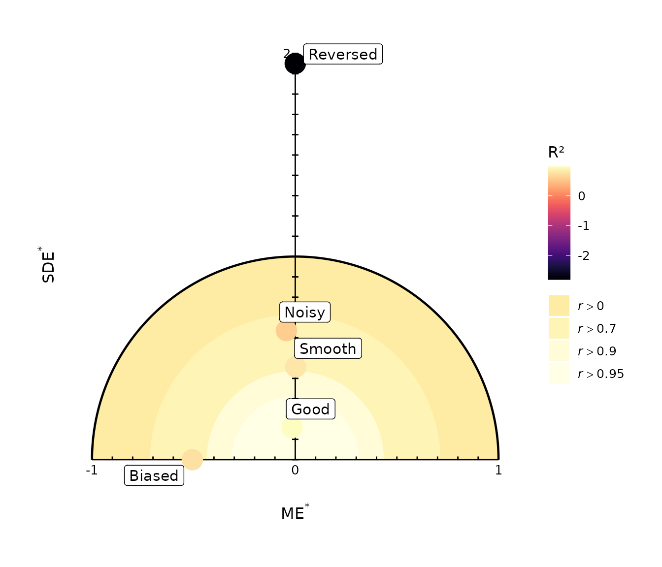
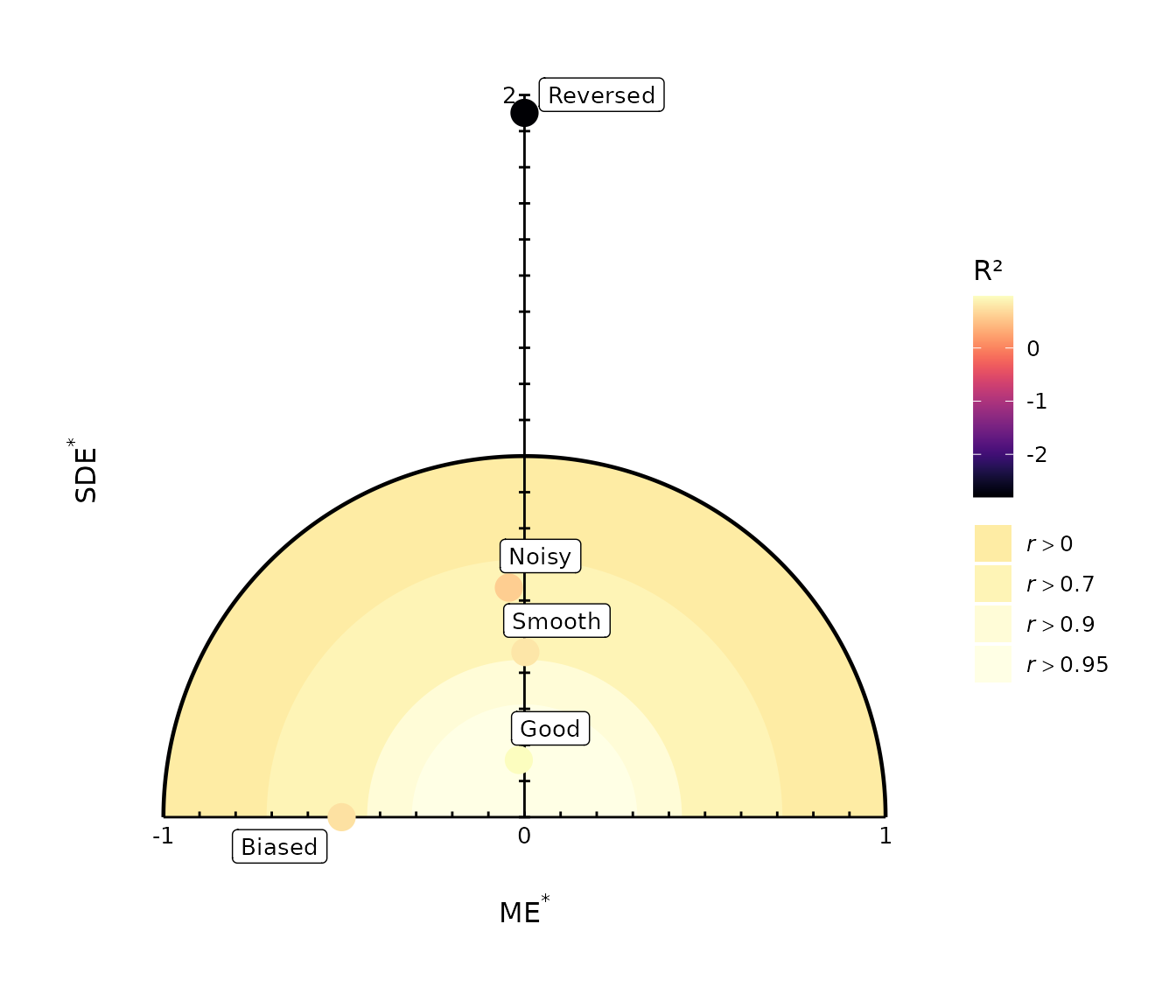
The expected patterns are informative:
-
Goodshould lie close to the origin; -
Biasedshould be displaced mainly along the horizontal axis; -
Smoothshould have relatively little bias but a larger centred-error component because it does not reproduce the full variability of the observations; -
Noisyshould lie high on the diagram; -
Reversedshould perform poorly because its pattern is inconsistent with the observations.
Models can therefore have similar overall RMSE while occupying different positions in the diagram if the relative contributions of bias and centred error differ.
One important advantage of the solar diagram over the Taylor diagram is that mean bias contributes directly to position and distance from the optimum. The diagram therefore combines information on systematic error, centred error, and overall prediction performance in a single geometric representation.
3.3 Colour models instead of writing labels
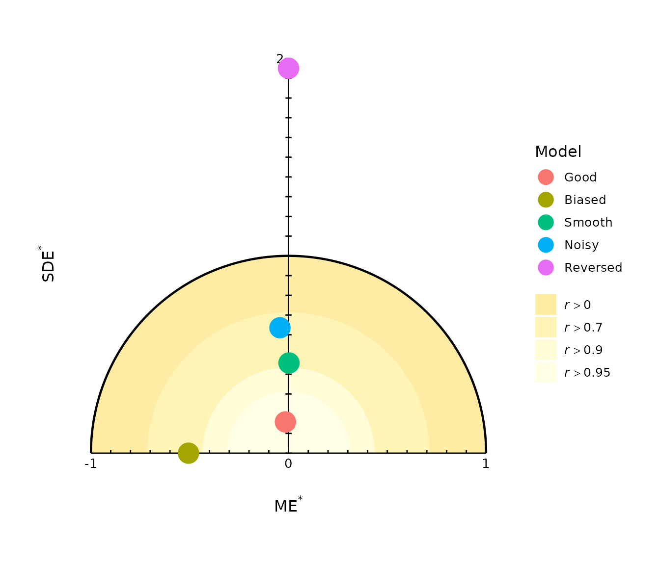
For several models, direct labels may become crowded. Use
colour_by = "model" to identify models through a
legend:
gg_solar(
  models,
  obs,
  colour_by = "model",
  y.axis_end = 2
)
By default, however, point colour represents model efficiency:
gg_solar(
  models,
  obs,
  y.axis_end = 2
)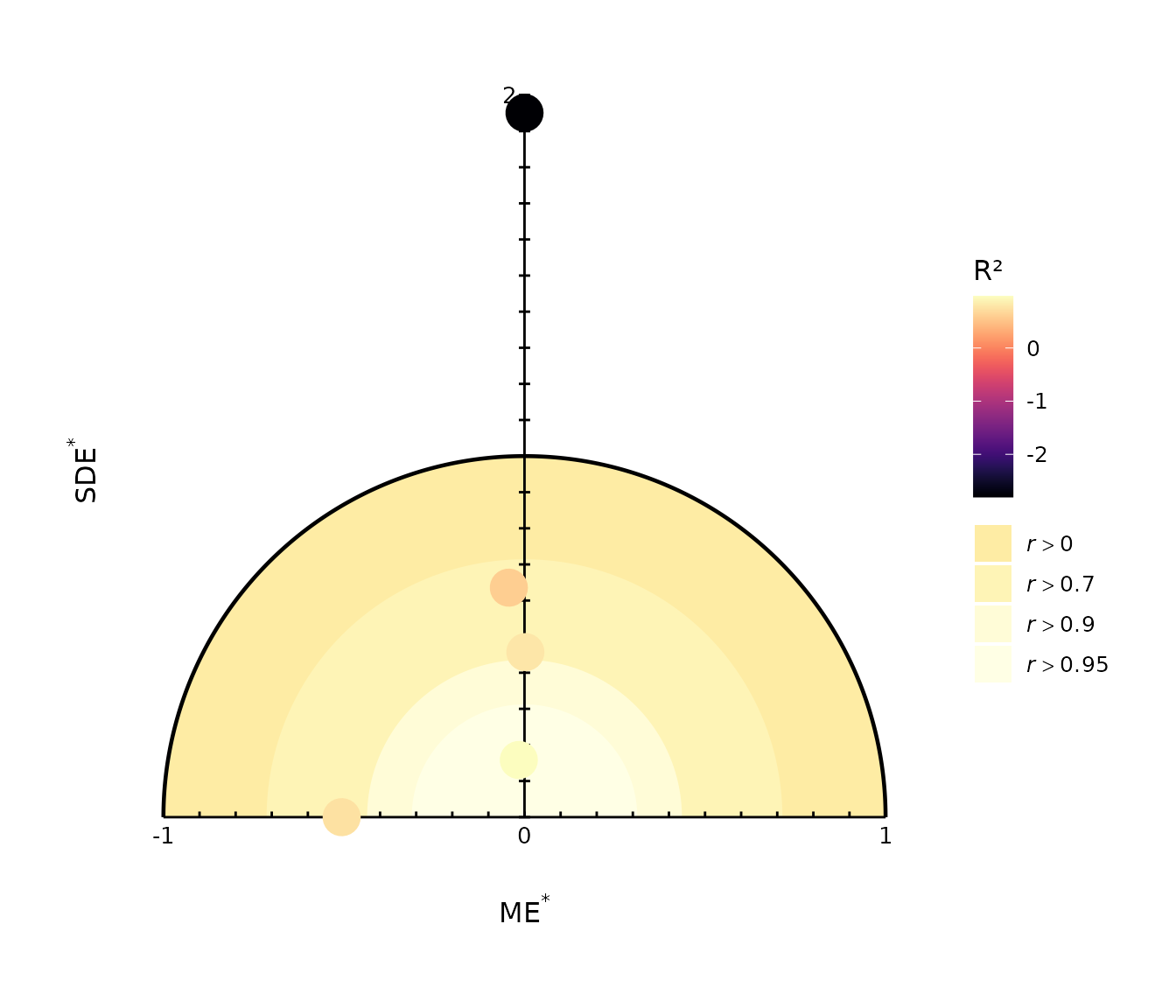
The default efficiency colour is uppercase R^2, which in modelskill is
equivalent to NSE and MEC. Higher values indicate better squared-error
performance, with R^2 = 1 corresponding
to perfect prediction and R^2 = 0
corresponding to the performance of predicting the observed mean.
This should not be confused with lowercase r2(), which is squared
Pearson correlation and therefore measures association rather than model
efficiency.
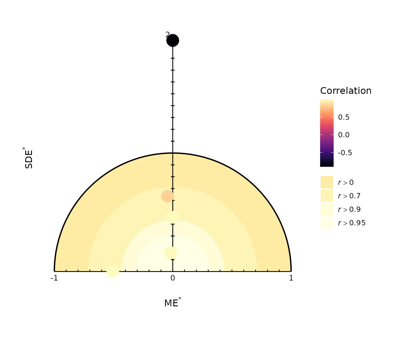
Other available colour mappings are:
gg_solar(
  models,
  obs,
  colour_by = "correlation",
  y.axis_end = 2
)
gg_solar(
  models,
  obs,
  colour_by = "r2",
  y.axis_end = 2
)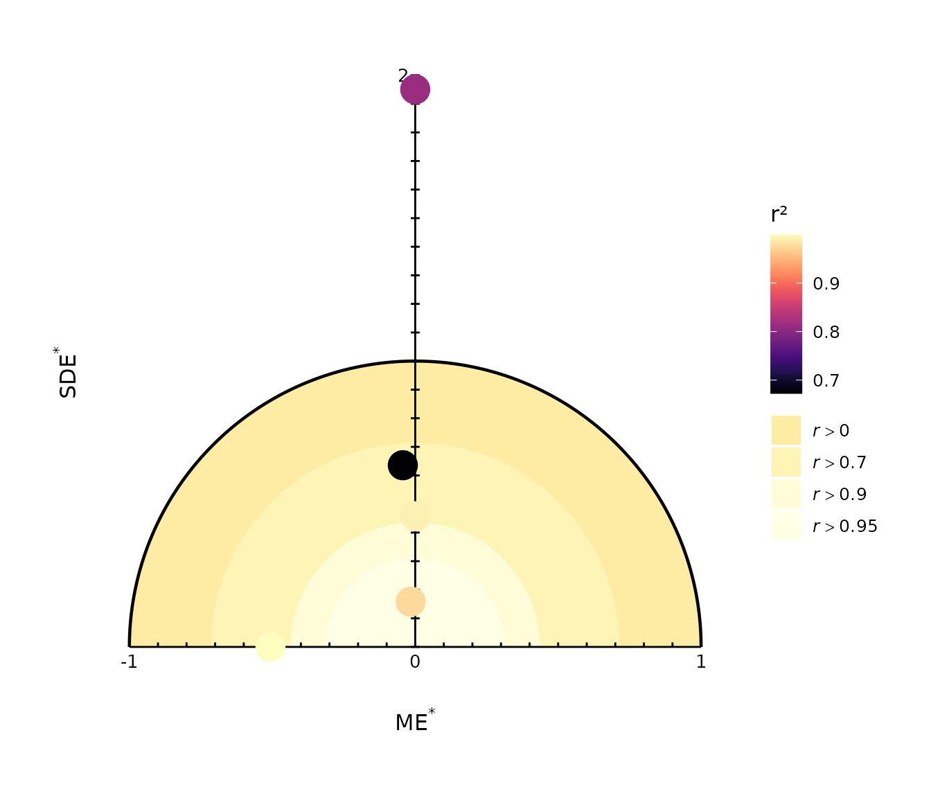
Here, colour_by = "correlation" uses Pearson
correlation, whereas colour_by = "r2" uses squared Pearson
correlation.
3.4 Control the reference geometry
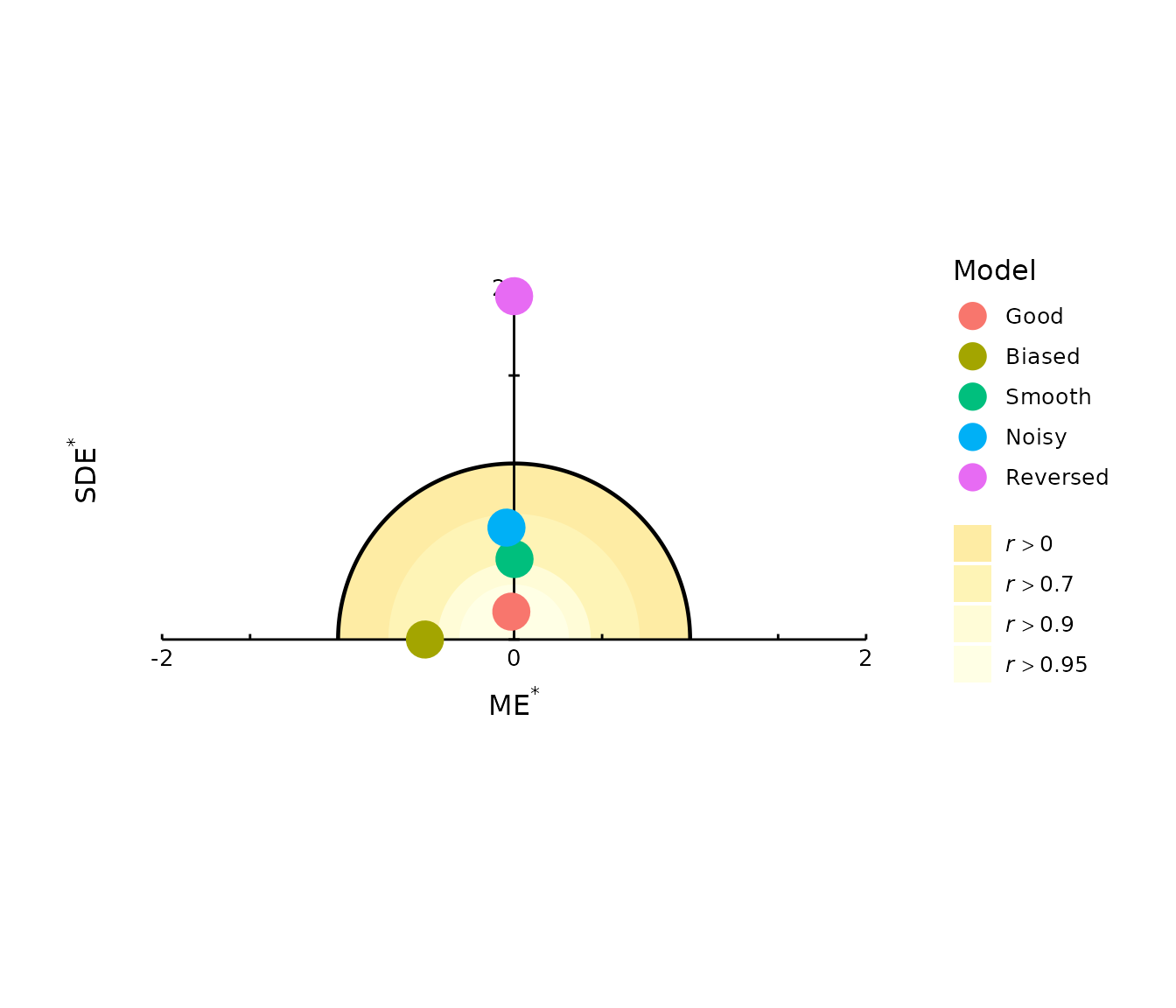
The manually drawn reference axes can be adjusted with
x.axis_begin, x.axis_end,
y.axis_end, and by. This is useful when one or
more models fall outside the default plotting range or when a common
plotting extent is required across several figures.
gg_solar(
  models,
  obs,
  colour_by = "model",
  x.axis_begin = -2,
  x.axis_end = 2,
  y.axis_end = 2,
  by = 0.5
)
The reference regions can also be removed:
gg_solar(
  models,
  obs,
  colour_by = "model",
  y.axis_end = 2,
  reference = FALSE
)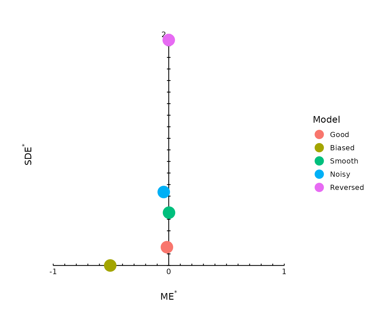
This can be useful when the main objective is to compare model positions without displaying the correlation regions.
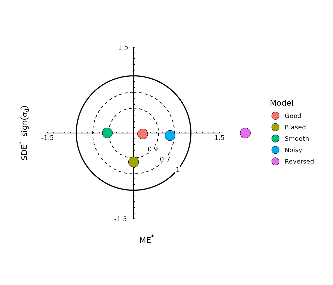
4. Target diagram
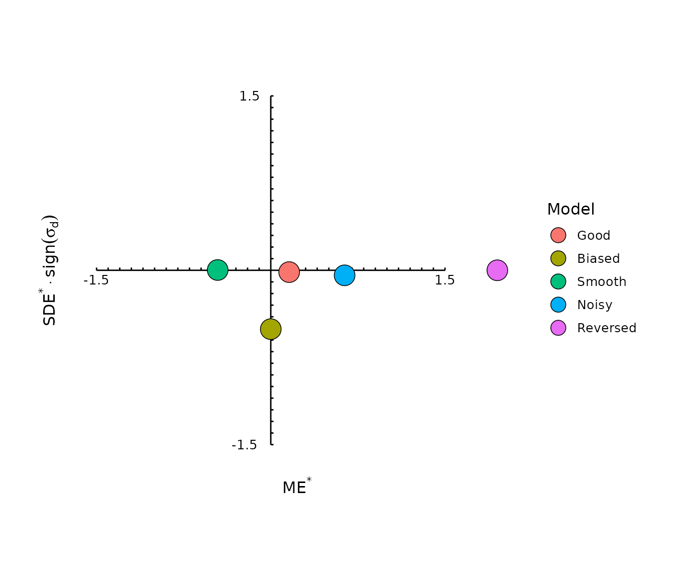
The target diagram was introduced by Jolliff et al. (2009) as a compact summary of bias, centred error, and prediction variability.
4.1 Reading a target diagram
The distance from the origin remains standardized RMSE:
\mathrm{RMSE}^{*} = \sqrt{ \mathrm{ME}^{*2} + \mathrm{SDE}^{*2} }.
Points close to the origin therefore have smaller overall error.
The two components answer different questions:
- ME* identifies systematic overprediction or underprediction;
- signed SDE* combines centred error with information about whether predictive variability is smaller or larger than observed variability.
A prediction with the correct mean but too little variation will therefore be separated from a prediction with the correct mean but excessive variation.
This additional sign information is useful diagnostically, but it also means that models with similar absolute SDE and RMSE can appear on opposite sides of the diagram. The target diagram should therefore be interpreted in terms of its components rather than simply by comparing the apparent separation between points.
4.1.1 Note on the modelskill coordinate convention
Internally, gg_target() plots
signed SDE* on the horizontal coordinate and
ME* on the vertical coordinate. The current graphical
implementation retains the historical axis-title orientation of the
package. When interpreting model positions, the coordinate definitions
given here and in the function documentation are authoritative.
4.2 Basic target diagram
gg_target(
  models,
  obs,
  label = TRUE
)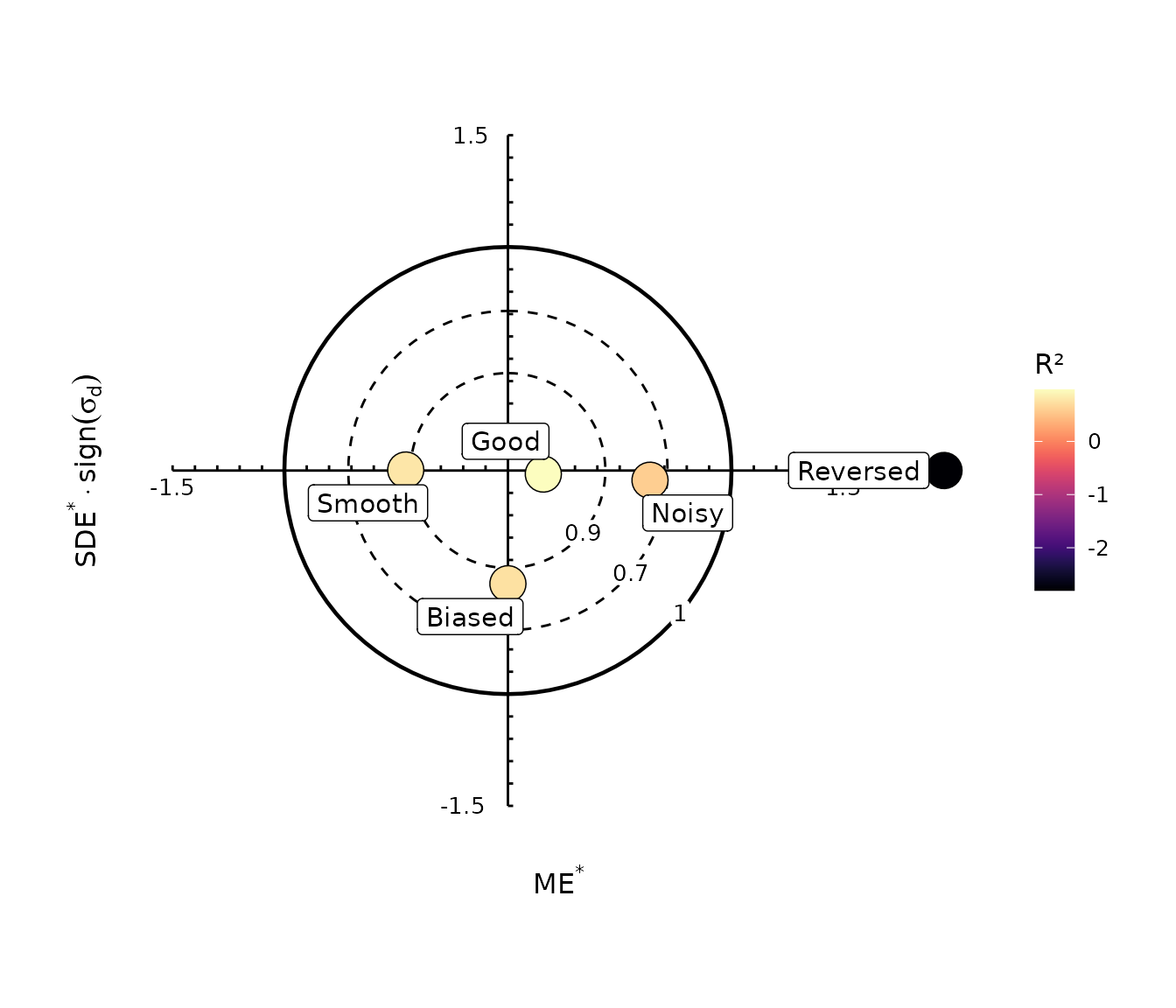
For the example models:
-
Goodshould lie nearest the origin; -
Biasedshould be displaced mainly by its mean-error component; -
Smoothshould fall on the side associated with prediction variability smaller than the observed variability; -
Noisyshould fall on the side associated with excessive prediction variability.
4.3 Colour models with a legend
gg_target(
  models,
  obs,
  colour_by = "model"
)
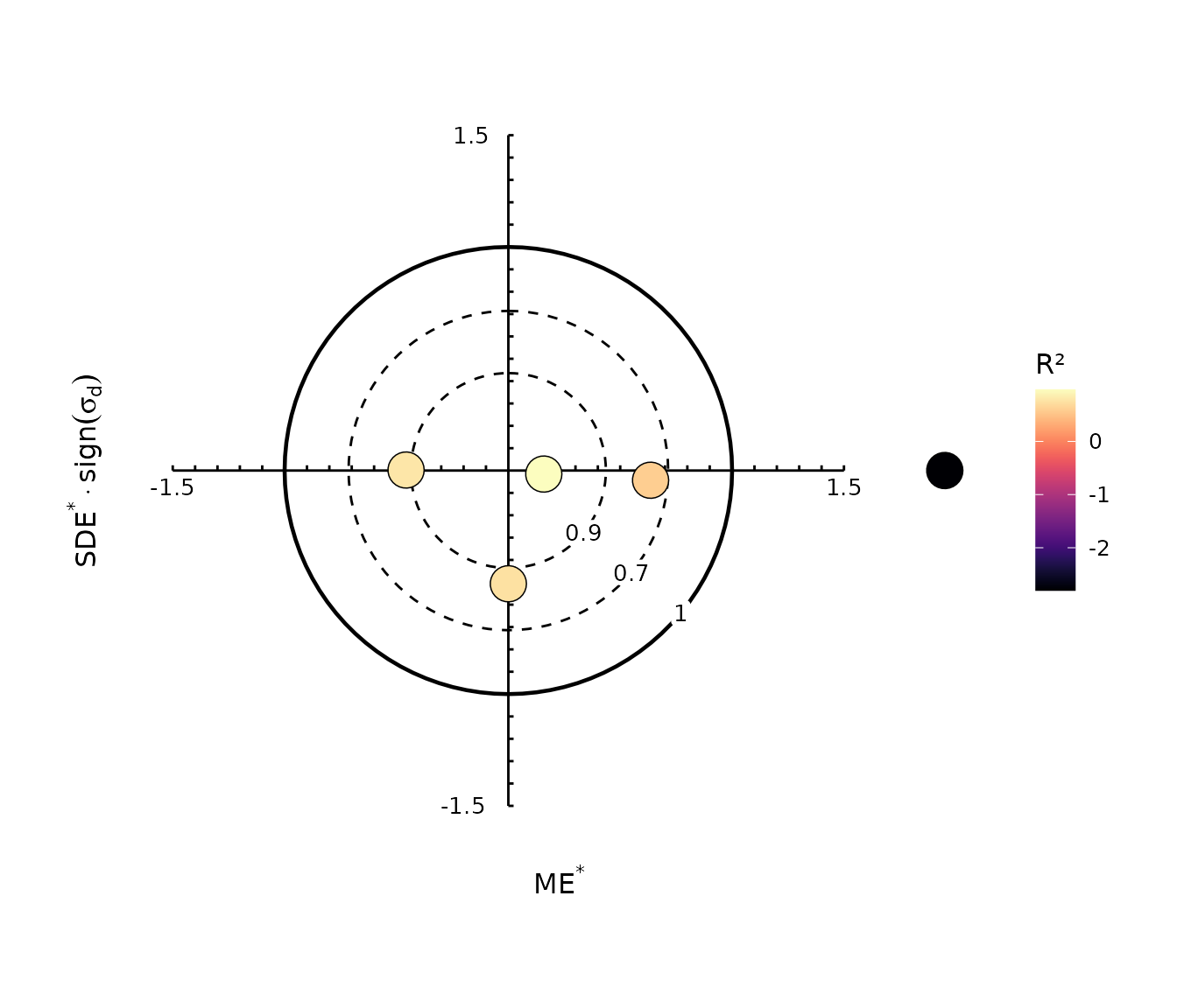
As in the solar diagram, the default colour variable is model efficiency:
gg_target(
  models,
  obs
)
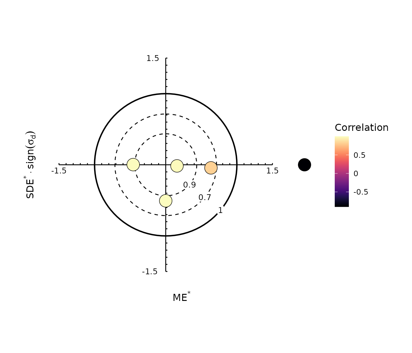
Correlation and squared correlation can also be used:
gg_target(
  models,
  obs,
  colour_by = "correlation"
)
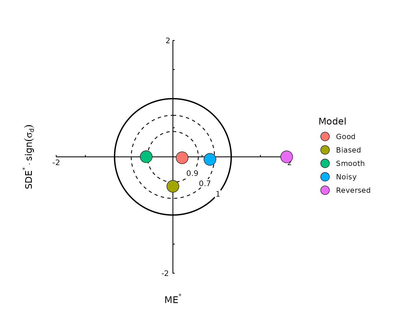
4.4 Change the displayed range
axis_begin, axis_end, and by
control the manually drawn target-diagram axes:
gg_target(
  models,
  obs,
  colour_by = "model",
  axis_begin = -2,
  axis_end = 2,
  by = 0.5
)
The reference circles can be removed with:
gg_target(
  models,
  obs,
  colour_by = "model",
  reference = FALSE
)
5. Taylor diagram
The Taylor diagram was introduced by Taylor (2001) to summarize several aspects of pattern agreement between predictions and observations.
It simultaneously represents:
- Pearson correlation r;
- the ratio of prediction to observation standard deviation;
- centred root mean square difference.
Let
\sigma^{*} = \frac{\mathrm{sd}(pred)} {\mathrm{sd}(obs)}.
The radial coordinate of a Taylor diagram is \sigma^{*}, while the angular coordinate is
\theta = \arccos(r).
The centred standardized error is related to these quantities by the law of cosines:
\mathrm{SDE}^{*} = \sqrt{ 1+\sigma^{*2}-2\sigma^{*}r }.
Again, modelskill retains the finite-sample convention
of the original implementation; diagram_stats()
documents the exact scaling used by the package.
5.1 The reference point
Perfect predictions have
r=1 \qquad\text{and}\qquad \sigma^{*}=1.
They therefore occupy the reference point on the positive horizontal axis.
Distance from a model point to this reference is proportional to centred error: points nearer the reference have smaller \mathrm{SDE}^{*}.
The diagram can therefore be read in three complementary ways:
- angle: correlation or pattern agreement;
- radius: prediction variability relative to observed variability;
- distance from the reference point: centred prediction error.
A point inside the unit-radius arc has less variation than the observations and therefore represents a smoother prediction. A point outside that arc has greater variation.
5.2 Full Taylor diagram
By default, gg_taylor() displays correlations from -1 to
1:
gg_taylor(
  models,
  obs,
  label = TRUE
)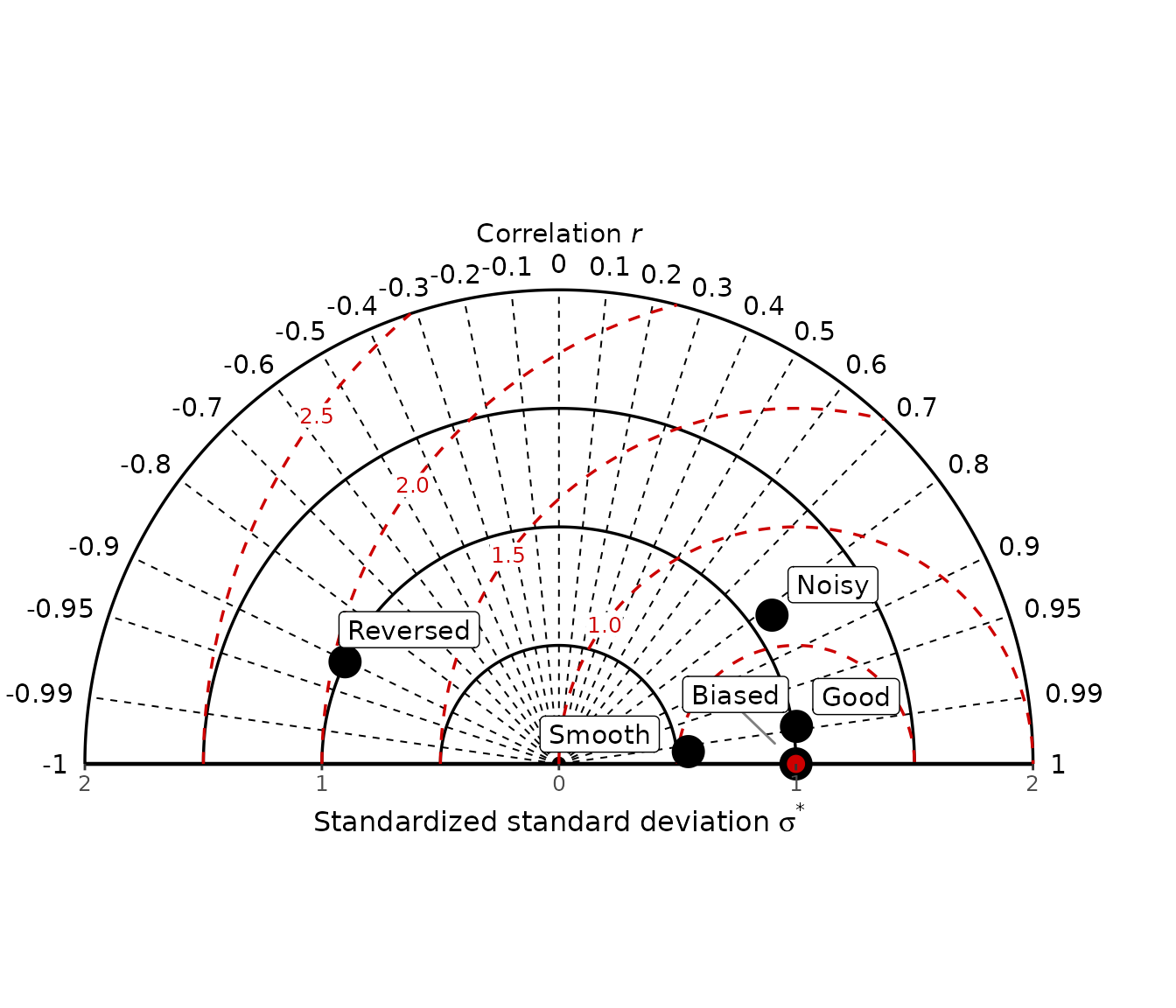
This is particularly useful when negative correlations are scientifically possible.
The Reversed model in the example should appear on the
negative-correlation side of the diagram because its pattern is
approximately reversed relative to the observations.
5.3 Half Taylor diagram
In many prediction problems only positive correlations are of
practical interest. Set half = TRUE to show only
correlations from 0 to 1:
gg_taylor(
  models,
  obs,
  legend = TRUE,
  half = TRUE
)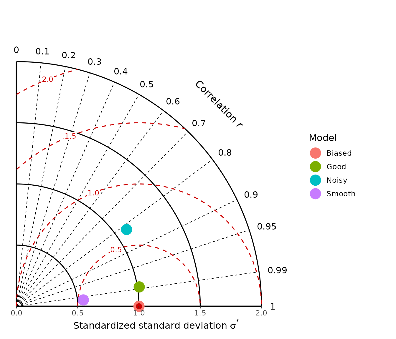
Models with negative correlation are omitted from the half diagram.
Thus the Reversed model shown in the full Taylor diagram is
not displayed here.
The half diagram is often easier to read when all relevant models are positively correlated.
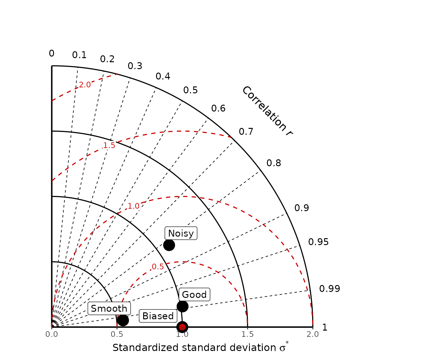
5.4 Labels or legend
Use label = TRUE when the number of models is small:
gg_taylor(
  models,
  obs,
  label = TRUE,
  half = TRUE
)
Alternatively, use legend = TRUE:
gg_taylor(
  models,
  obs,
  legend = TRUE,
  half = TRUE
)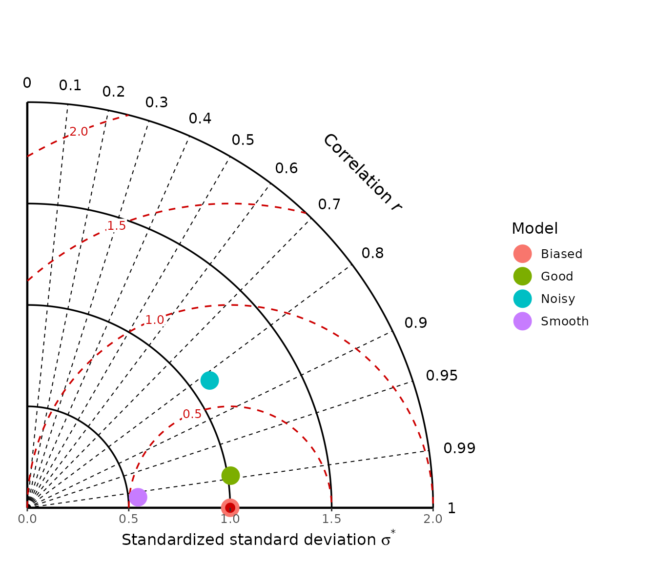
For gg_taylor(), label = TRUE and
legend = TRUE are alternative ways of identifying models
and should not be requested simultaneously.
5.5 Centred RMSD contours
The curved contours around the reference point represent standardized centred RMSD or SDE.
They are displayed by default.
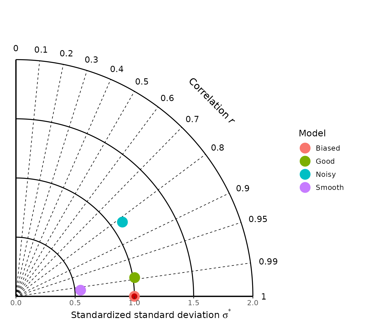
Remove them with:
gg_taylor(
  models,
  obs,
  legend = TRUE,
  half = TRUE,
  rmsd = FALSE
)
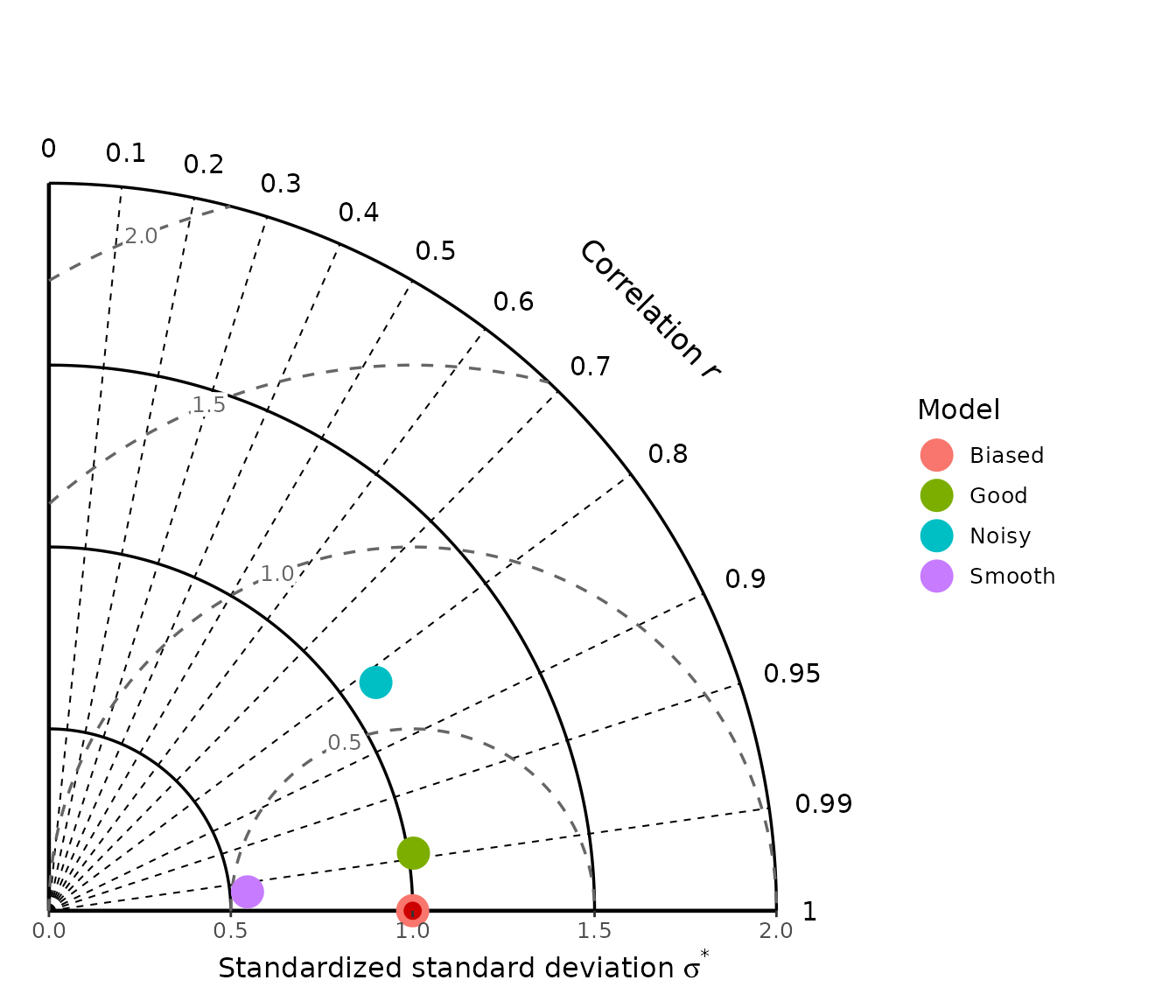
Change their colour with:
gg_taylor(
  models,
  obs,
  legend = TRUE,
  half = TRUE,
  rmsd_colour = "grey40"
)
Or specify the contour values directly:
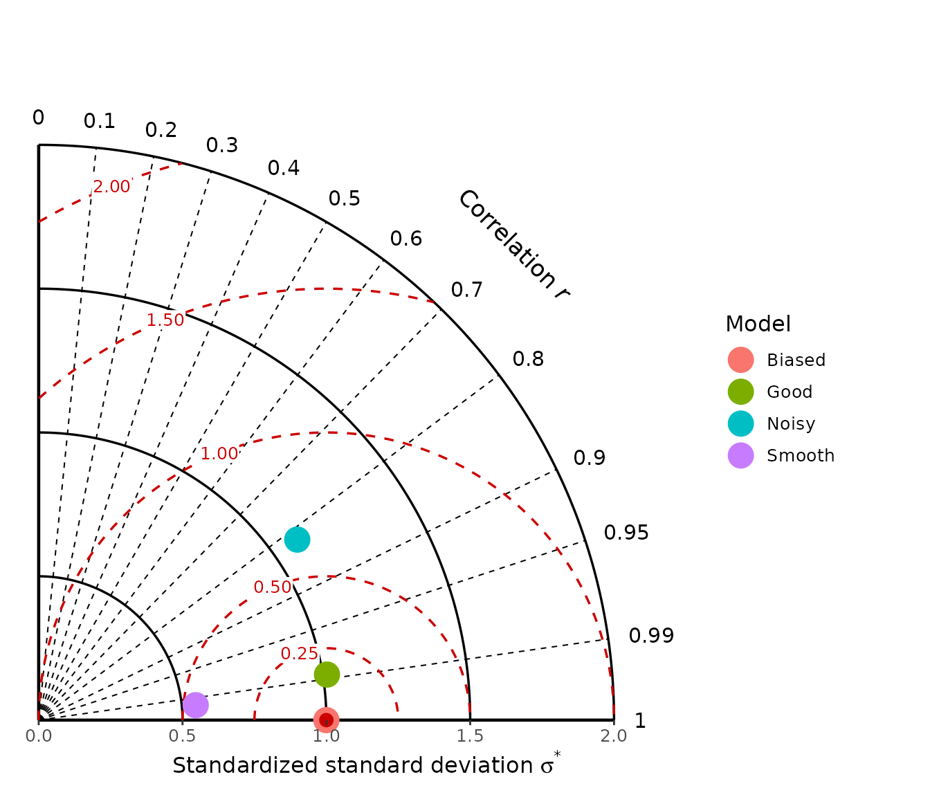
5.6 A limitation of the Taylor diagram
The Taylor diagram deliberately works with centred quantities and therefore does not show mean error.
This can produce an apparently surprising result for the
Biased model:
diagram_stats(
  models[c("Good", "Biased")],
  obs
)
#>    model   n         r sd_ratio  mean_error         nME          sde
#> 1   Good 150 0.9877441  1.01456 -0.04662284 -0.01574093 1.583687e-01
#> 2 Biased 150 1.0000000  1.00000 -1.50000000 -0.50643404 1.727220e-16
#>     signed_sde
#> 1 1.583687e-01
#> 2 1.727220e-16

gg_taylor(
  models[c("Good", "Biased")],
  obs,
  label = TRUE,
  half = TRUE
)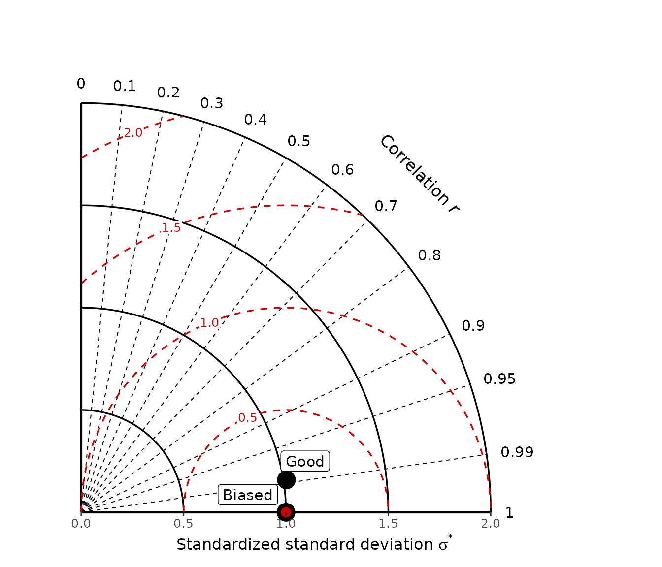
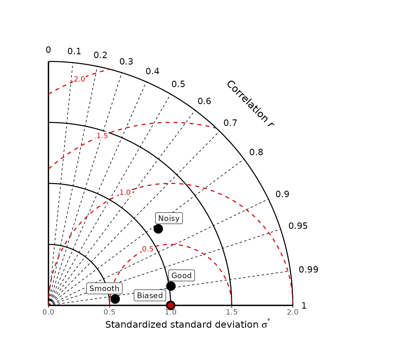
Adding a constant to every prediction changes its mean error but leaves its correlation and standard deviation essentially unchanged. The biased model can therefore appear close to the Taylor reference point despite having a large systematic error.
This is one reason the Taylor diagram should be interpreted together with bias statistics or with a diagram that explicitly includes mean error, such as the solar or target diagram.
6. Which diagram should I use?
The three diagrams are complementary rather than competing alternatives.
| Question | Solar | Target | Taylor |
|---|---|---|---|
| Is the model biased? | Yes | Yes | No |
| What is the total standardized RMSE? | Yes | Yes | No |
| What is the centred error? | Yes | Yes | Yes |
| Is prediction variability too small or too large? | Indirectly | Yes | Yes |
| What is the exact Pearson correlation? | No | No | Yes |
| Can negative correlation be displayed explicitly? | No | No | Yes, with full diagram |
| Is performance relative to the mean benchmark visible? | Yes | Yes | No |
A useful practical approach is:
Start with the solar diagram when the objective is a broad assessment of prediction performance, because it includes both systematic and centred error.
Use the target diagram when distinguishing under-dispersed from over-dispersed predictions is particularly important.
Use the Taylor diagram when the primary interest is pattern agreement, correlation, and reproduction of variability.
No diagram should replace the underlying numerical metrics. Summary diagrams are most useful when they help interpret several complementary statistics together.
7. Customising the diagrams with ggplot2
All three plotting functions return ordinary ggplot2
objects. This means that standard ggplot additions can be applied after
the diagram has been created.
7.1 Add titles and change the theme
p <- gg_solar(
  models,
  obs,
  colour_by = "model",
  y.axis_end = 2
)

p +
  ggplot2::labs(
    title = "Comparison of prediction models",
    subtitle = "Solar diagram"
  ) +
  ggplot2::theme_minimal()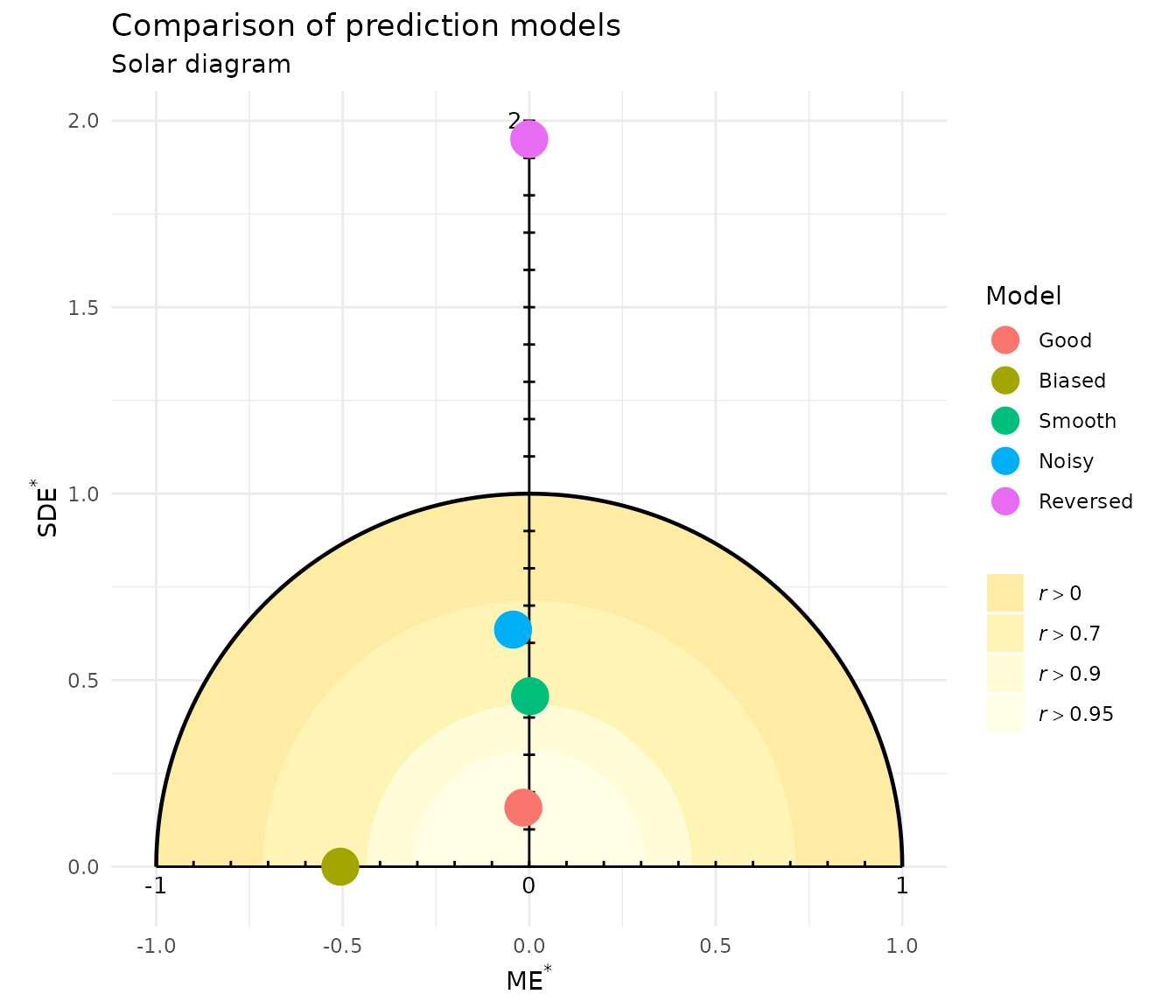
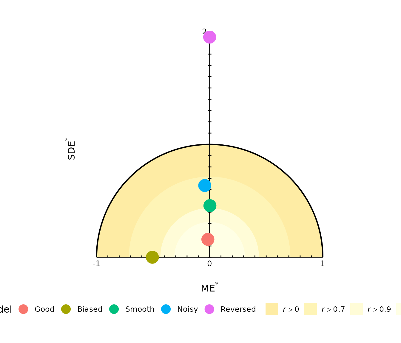
7.2 Move the legend
gg_solar(
  models,
  obs,
  colour_by = "model",
  y.axis_end = 2
) +
  ggplot2::theme(
    legend.position = "bottom"
  )
The same approach works for the target and Taylor diagrams.
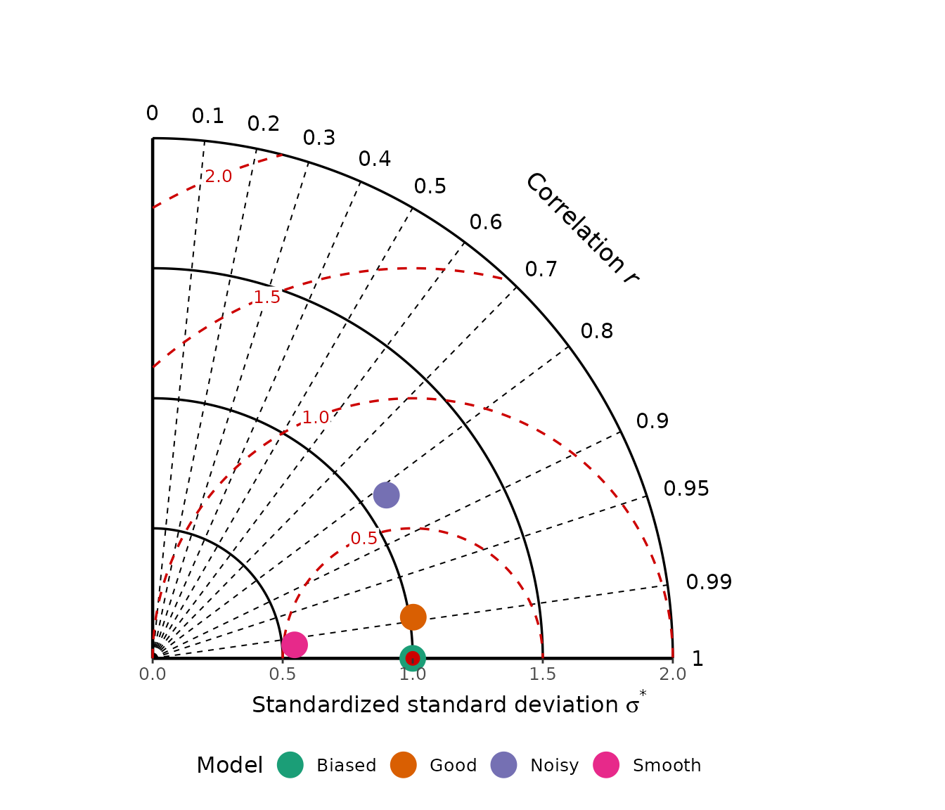
7.3 Change the model colour palette
For the Taylor diagram, models are mapped to the colour
aesthetic when legend = TRUE:
gg_taylor(
  models,
  obs,
  legend = TRUE,
  half = TRUE
) +
  ggplot2::scale_colour_brewer(
    palette = "Dark2"
  ) +
  ggplot2::theme(
    legend.position = "bottom"
  )
For the target diagram, model colours use the fill
aesthetic:
gg_target(
  models,
  obs,
  colour_by = "model"
) +
  ggplot2::scale_fill_brewer(
    palette = "Dark2"
  ) +
  ggplot2::theme(
    legend.position = "bottom"
  )
#> Scale for fill is already present.
#> Adding another scale for fill, which will replace the existing scale.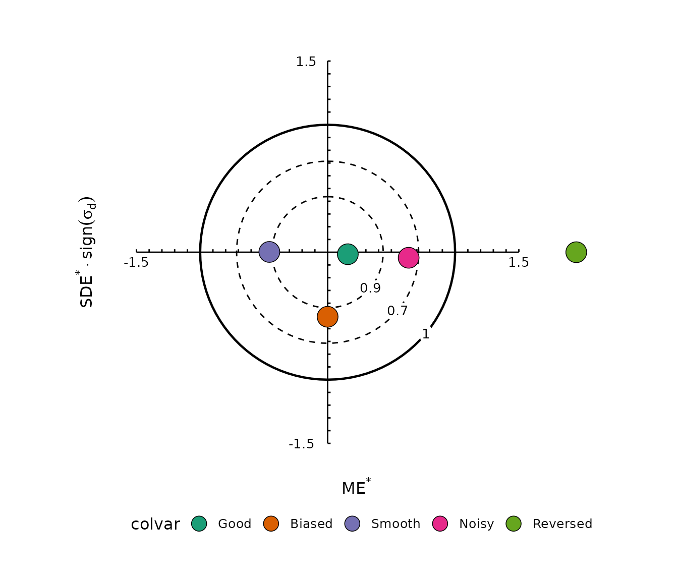
Adding a new scale replaces the default scale defined by the diagram function.
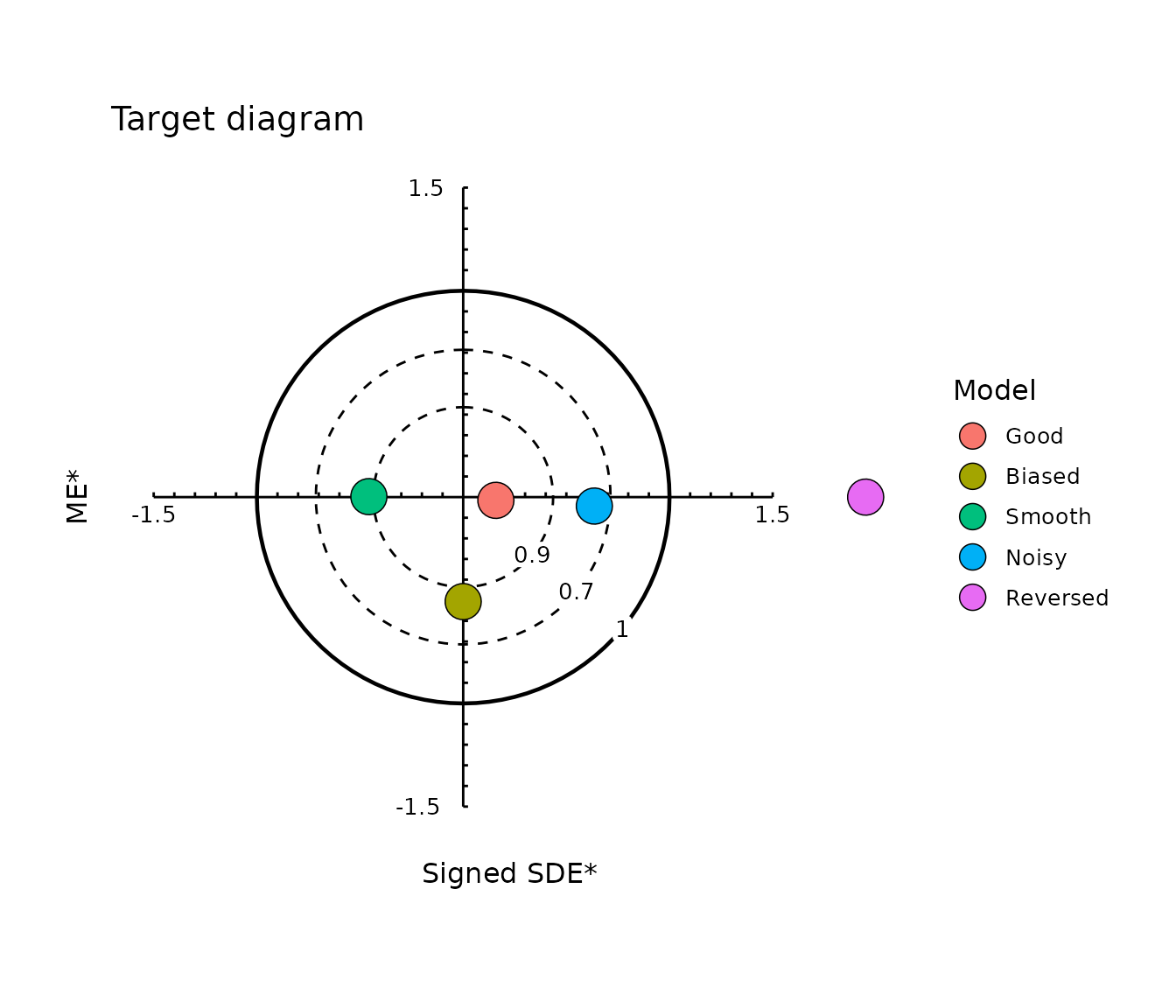
7.4 Change the target axis titles
Because a gg_target() result is a normal ggplot object,
the displayed labels can be replaced without changing the underlying
coordinates.
For example, to label the coordinates explicitly according to the
values stored by modelskill:
gg_target(
  models,
  obs,
  colour_by = "model"
) +
  ggplot2::labs(
    x = "Signed SDE*",
    y = "ME*",
    title = "Target diagram"
  )
7.5 Zoom without changing the statistics
The axis arguments of gg_solar() and
gg_target() define their manually drawn reference geometry
rather than clipping the data.
Because the returned plots are ggplot objects, a custom coordinate window can also be added when a closer view is useful:
gg_solar(
  models,
  obs,
  colour_by = "model",
  y.axis_end = 2
) +
  ggplot2::coord_fixed(
    xlim = c(-1.5, 1.5),
    ylim = c(0, 1.5)
  )
#> Coordinate system already present.
#> ℹ Adding new coordinate system, which will replace the existing one.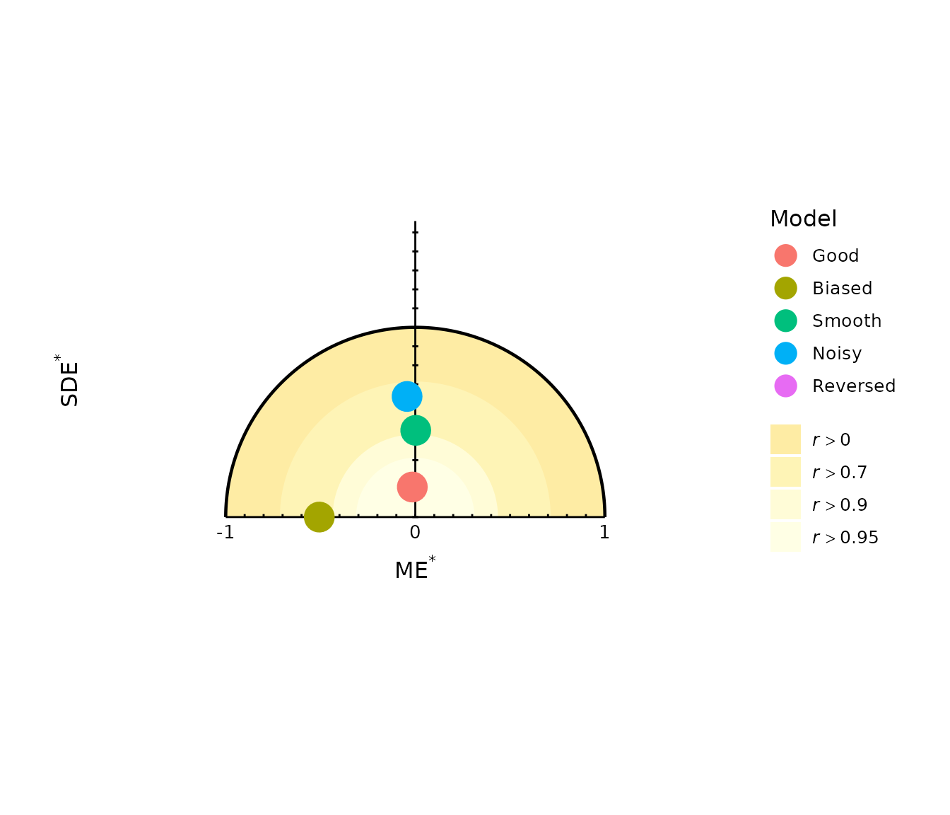
Equal x and y scaling should be retained for solar and target diagrams because their interpretation depends on geometric distances and circular reference lines.
7.6 Change point and label sizes
Core diagram elements that have direct function arguments should generally be changed through those arguments rather than by adding ggplot layers:
gg_solar(
  models,
  obs,
  label = TRUE,
  point_size = 5,
  label_size = 3.5,
  y.axis_end = 2
)
Similarly:
gg_taylor(
  models,
  obs,
  label = TRUE,
  half = TRUE,
  point_size = 5,
  label_size = 3.5
)
8. Practical recommendations
When using summary diagrams:
Use the same validation observations for all models being compared.
Check the numerical statistics with
diagram_stats()when a model position requires closer interpretation.Remember the error convention
obs - pred: negative mean error means overprediction and positive mean error means underprediction.Do not interpret a Taylor diagram as a measure of overall prediction accuracy because it does not include mean bias.
Do not interpret the solar correlation regions as exact correlation values; they represent lower bounds.
In a target diagram, consider both the absolute distance from the origin and the sign of the centred-error component.
Use the diagrams alongside numerical performance metrics rather than as substitutes for them.
The central benefit of these diagrams is that they make statistical relationships visible. A model can have excellent correlation but substantial bias, low total error but excessive smoothing, or similar RMSE to another model for very different reasons. Summary diagrams help distinguish these situations without relying on a single performance statistic.